2021
Making complex data accessible
The Pension Finder program in the UK is an initiative aimed at providing individuals with a comprehensive and accessible overview of their pension savings. It serves as a centralized digital platform where individuals can view and track all their pension arrangements in one place.
The main objective of the Pension Finder is to empower people to take control of their retirement planning by offering them a clear and convenient way to keep tabs on their pension pots. This platform is particularly beneficial in the UK, where many individuals may have multiple pension accounts from different employers, making it challenging to monitor and manage their retirement savings effectively.
The Pension Finder, aims to make pension planning more transparent, helping people make informed decisions about their retirement, such as when to retire and how to optimize their pension savings.
Problem statement
The landscape of pension management in the UK is characterized by complexity and confusion. A significant portion of the population, spanning diverse age groups and financial backgrounds, struggles to comprehend the intricate details of their pension savings. The absence of user-friendly tools and accessible resources impedes individuals’ ability to make well-informed decisions about their financial futures.The landscape of pension management in the UK is characterized by complexity and confusion. A significant portion of the population, spanning diverse age groups and financial backgrounds, struggles to comprehend the intricate details of their pension savings. The absence of user-friendly tools and accessible resources impedes individuals’ ability to make well-informed decisions about their financial futures.
Among the prevailing issues:
- Information overload: Complex financial terms and detailed investment info confuse users, hindering pension plan understanding and effective management.
- Lack of clarity: Technical language in pension documents confuses users about contributions, fund distribution, and earnings, causing frustration.
- Limited accessibility: Seniors and those with disabilities face digital challenges. Poor interfaces exclude them, denying access to vital financial tools.
- Scattered information: Pension data scattered across platforms creates confusion, hindering comprehensive understanding and effective planning.
Addressing these multifaceted challenges is imperative to empower individuals with the knowledge and tools necessary to take control of their pension savings effectively, fostering financial security and confidence in their retirement years.
Project assignments and responsibilities:
I led the creation of an intuitive, user-friendly, and visually appealing platform, empowering individuals to effectively take control of their pension savings. I focused on bridging the gap between complex financial data and the end-user, ensuring that the information was presented in a clear, accessible (WCAG 2.1 AA), and engaging manner.
I closely collaborated with user experience researchers, delving into user behaviors, preferences, and pain points. Harnessing this invaluable feedback, I meticulously refined and enhanced the dashboard’s design, striving to make it as user-centric as possible.
Additionally, I guided the development of a comprehensive design system and meticulously documented the design library.
Furthermore, I fostered a close collaboration with the front-end and back-end development teams, ensuring the product was developed in the quickest and most efficient way possible.
Design research


Unveiling insights
In the pursuit of creating a transformative user experience for the Pensions Finder, extensive design research became the cornerstone of the strategy. The objective was clear: to unravel the intricacies of user behaviors, preferences, and pain points surrounding pension management. This in-depth exploration was not merely a journey into understanding numbers; it was a profound dive into the financial aspirations, uncertainties, and challenges faced by individuals across diverse demographics.
Crafting innovation
The design ideation phase became a vibrant hub of creativity, innovation, and strategic thinking. Here, the goal was not only to envision a digital platform but to conceptualize an intuitive, empowering, and revolutionary tool that would redefine how individuals engage with their financial futures.
Dashboard user flow
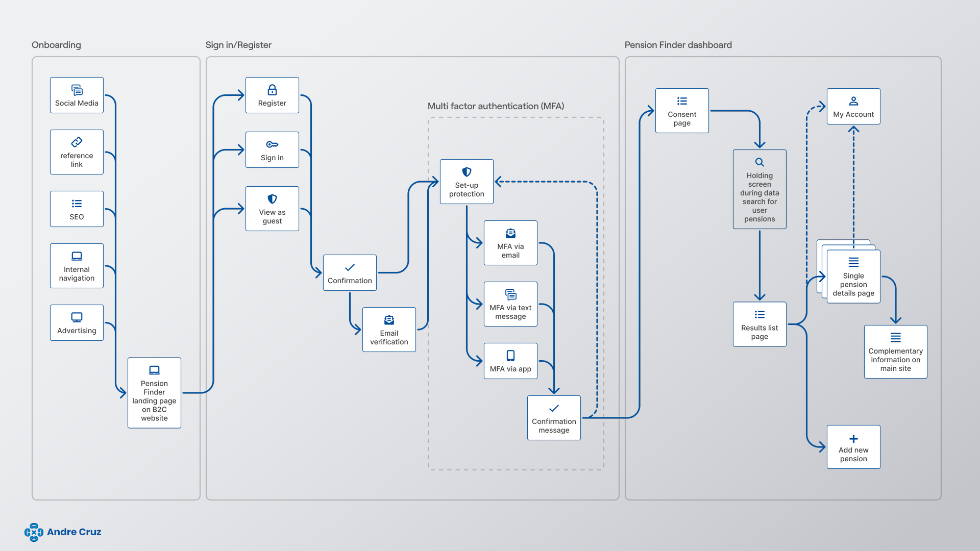
The Pension Finder’s user experience begins with tailored entry points and meticulous onboarding flows, ensuring a smooth initiation. Multifactor Authentication (MFA) acts as a robust security measure, fortifying the platform and instilling trust among users, especially in handling sensitive financial data.
Additionally, user consent plays a pivotal role, empowering users with data ownership and control. It fosters transparent communication, ensures legal compliance, facilitates personalized user experiences, builds trust and credibility, and empowers informed decisions about data sharing, creating a foundation of user trust and platform reliability.
Design wireframing: blueprinting an intuitive user journey
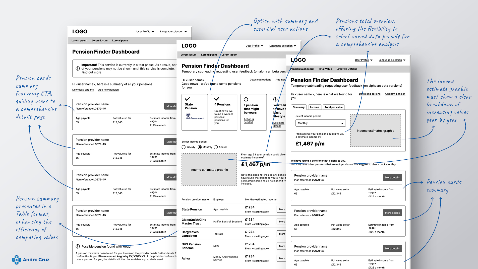
In the intricate process of bringing the Pensions Finder to life, design wireframing emerged as the blueprint, the skeletal framework upon which the entire user experience would be built. It was the pivotal stage where abstract ideas transformed into tangible, navigable structures, setting the foundation for an intuitive and empowering user interface.
- Idea to structure: Design wireframes served as the canvas where our creative visions took shape. Taking cues from the ideation phase, we translated innovative ideas into practical, structured elements. Each feature, from the personalized dashboard to interactive planning tools, found its designated space in the wireframes, ensuring a seamless flow of information and actions.
- Clear pathways: Meticulously crafted wireframes ensured users navigated complex data effortlessly. Through wireframing, we engineered intuitive menu structures, logical button placements, and streamlined content flow, ensuring that users would find their desired information without confusion.
Responsive version of onboarding screens
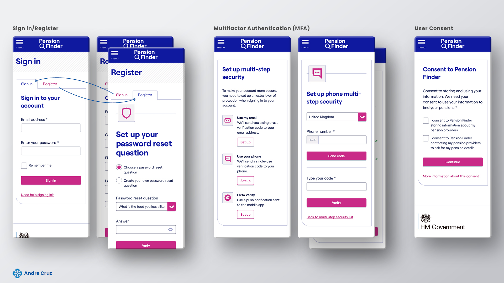
In the digital age, mobile devices are lifelines to the world. Responsive, accessible platforms are not just conveniences but essentials. They ensure universal access, accommodate diverse needs, enhance user experiences, foster inclusivity, boost visibility, and fulfill legal obligations.
Prioritizing responsiveness and accessibility isn’t just good design—it’s a commitment to inclusivity, empowering every user, regardless of their abilities, to engage fully in the digital landscape.
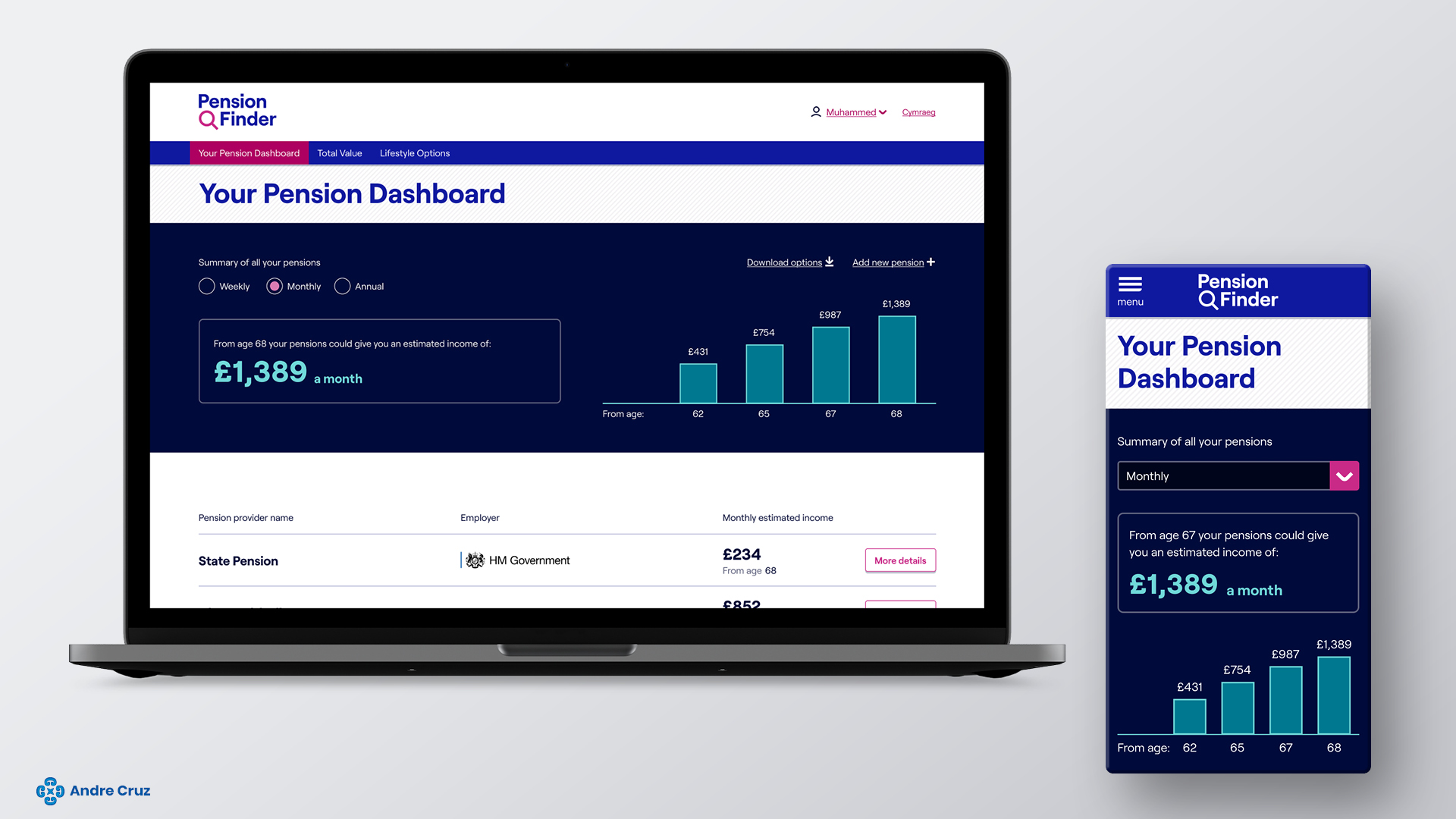
Dashboard beta version designs
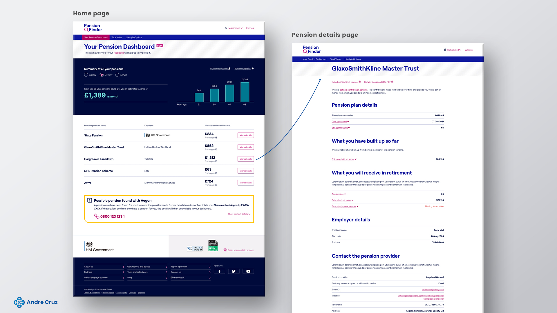
Developing a beta version of the dashboard is essential for real-world testing and user feedback integration. It helps identify and fix bugs, optimize performance, build stakeholder confidence, and gain a competitive edge.
A polished beta version ensures a smooth launch, enhancing user experience and platform credibility.
Design documentation and handover to dev team
Creating a detailed design documentation served as the blueprint that bridged the creative UX/UI designs with the technical implementation by development teams.
Its importance in the handover process cannot be overstated, for several crucial reasons:
- Clarity communication and visual alignment
- Time efficient development
- Consistency across platforms (responsiveness)
- Facilitated collaboration between designers, developers, and other stakeholders.
- Mitigated risks
In essence, design documentation was the cornerstone of the harmonious collaboration between design and development teams.
Its detailed guidance not only ensures a smooth handover but also lays the foundation for a cohesive, user-centered, and visually appealing end product, fostering a successful partnership between creative vision and technical execution.
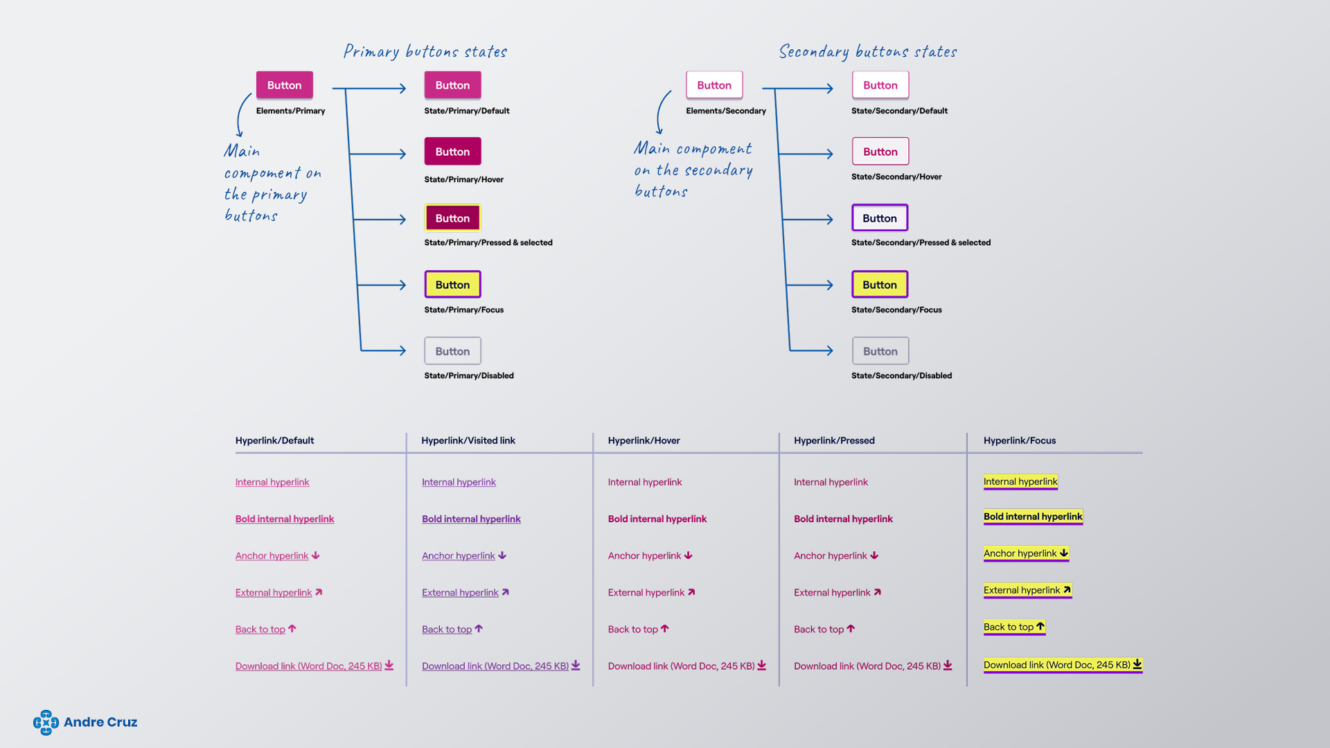
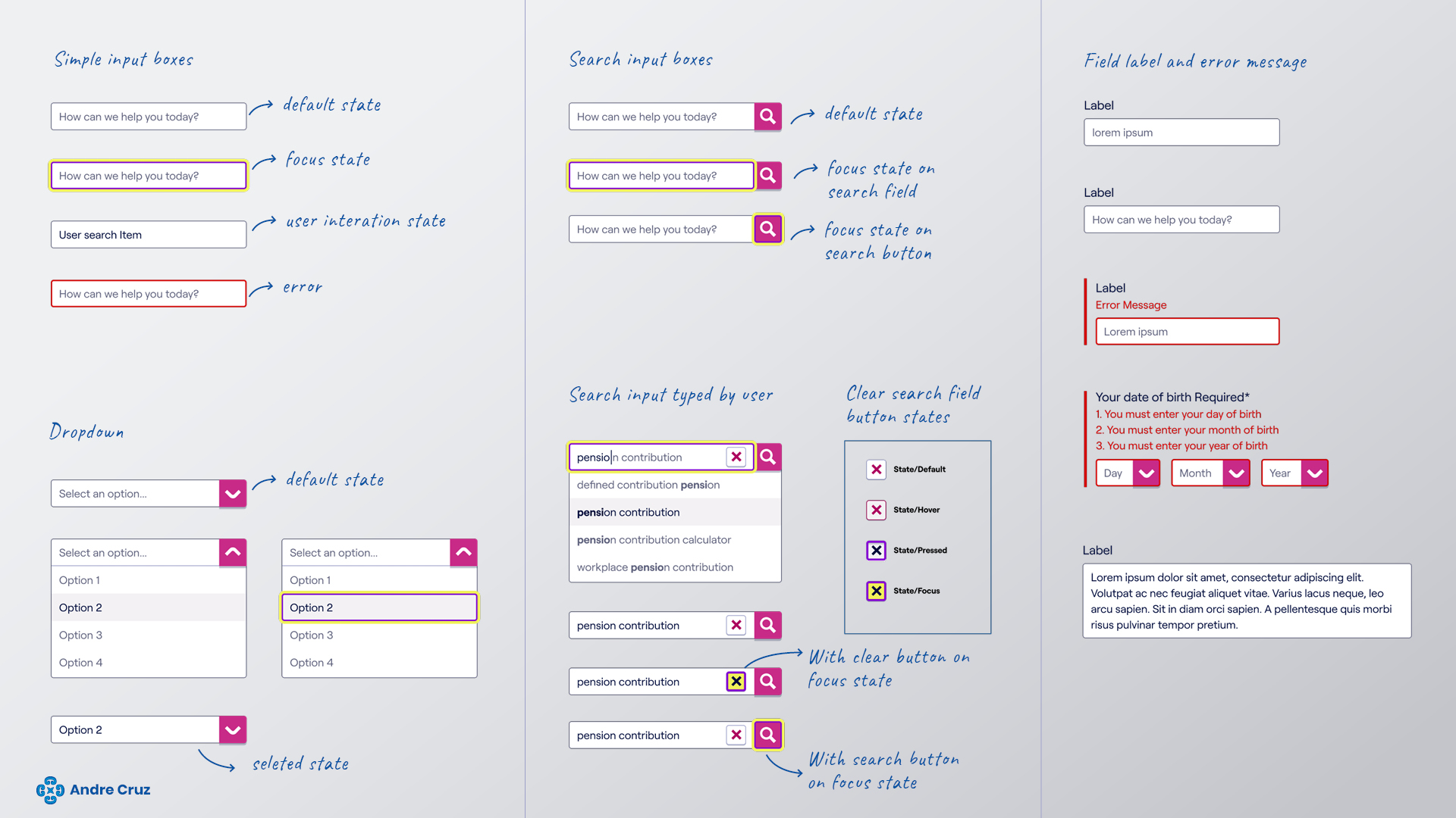
Documentation components examples
Buttons and hyperlinks
Input boxes
Conclusion: transforming pension finder into a seamless user experience
In this design case study, I explored the journey of enhancing the user interface for Pension Finder, focusing on making complex data accessible. The commitment to usability, accessibility, and visual appeal has resulted in a design that empowers individuals to take control of their pension savings effectively.
Your feedback is invaluable in shaping my ongoing efforts to enhance user experiences further. I invite you to share your thoughts, suggestions, or inquiries. I eagerly look forward to collaborating with you and making our future projects even better together.