2020
Crafting User Interfaces and Brand Development for the Pensions Dashboards Programme
The Money and Pensions Service (MaPS) has formed the Pensions Dashboards Programme team, tasked with designing and implementing the infrastructure for effective pensions dashboards. These dashboards will empower individuals to securely access their pension information online, consolidating it in one central location. This initiative aims to facilitate improved retirement planning and enhance overall financial well-being.
I was invited to spearhead the creation and development of UI designs for the Pensions Dashboard Programme website. The goal was to effectively communicate project updates, decisions, next steps, and the progress of pension dashboard work to the wider community and industry.
Project assignments and responsibilities:
- Spearheading the development and enforcement of brand and digital guidelines for the Pensions Dashboards Programme;
- Leading the strategy and design of the User Interface;
- Ensuring quality control in design processes;
- Developing a comprehensive design library documentation;
- Creating prototypes with defined specifications and assets;
- Collaborating closely with front-end and back-end development teams to ensure efficient and timely product releases.
Grid system
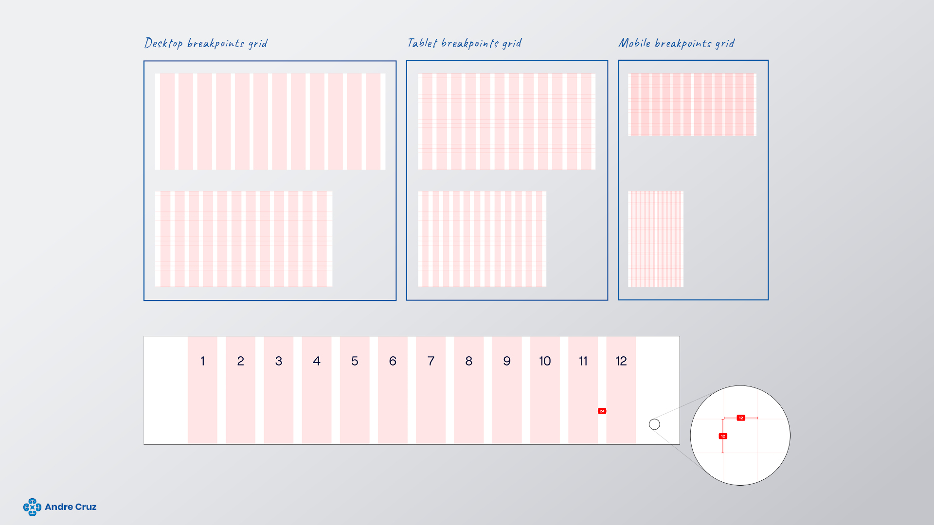
Utilizing a flexible grid with percentage-based columns, fixed margins, and gutters to dynamically adjust the layout, optimizing the available space for a seamless and responsive design.
320–740 mobile
12 Columns, gutters 16, margins 16.
741–1024 tablet
12 Columns, gutters 24, margins 24.
<1025 desk/laptop
12 Columns, gutters 24, margins 32
(page content width limited to 1272px).
Colour palette
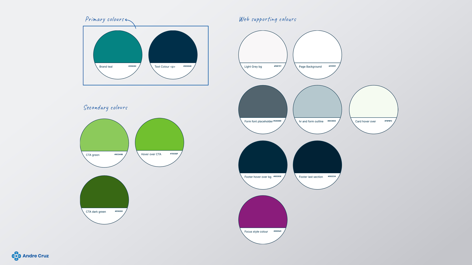
Pensions Dashboards Programme embraces vibrant, bold, and confident colours that stand out with a sense of positivity and trust. This colour palette aligns seamlessly with the core brand idea of the Pensions Dashboards Programme.
Typeface
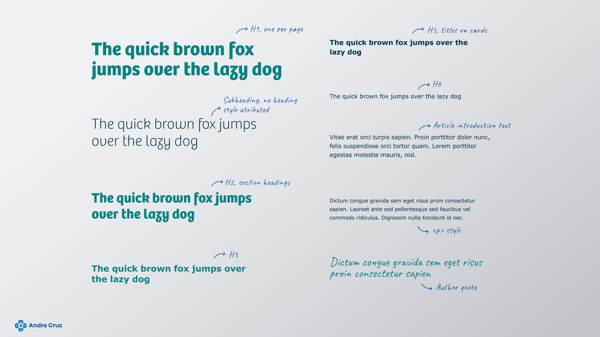
Verdana is the primary font, offering multiple weights, with Regular being the main choice for body copy.
Headings typeface
The secondary typeface, Bree, is employed for headings ranging from H1 to H3, enhancing the brand representation across the website.
Links

Buttons
The Pensions Dashboards Programme green color serves as the call-to-action hue.
A primary button style is designated as the main call-to-action on a page, and using multiple primary buttons on a single page is discouraged. Overuse diminishes their impact and creates confusion for users about the next steps.
A secondary button style is crafted for secondary calls-to-action on a page.
Hyperlinks
Hyperlinks are presented in the Pensions Dashboards Programme green color, aligning with the call-to-action theme. Multiple states are defined to ensure compliance with WCAG 2.1 AA web accessibility standards.
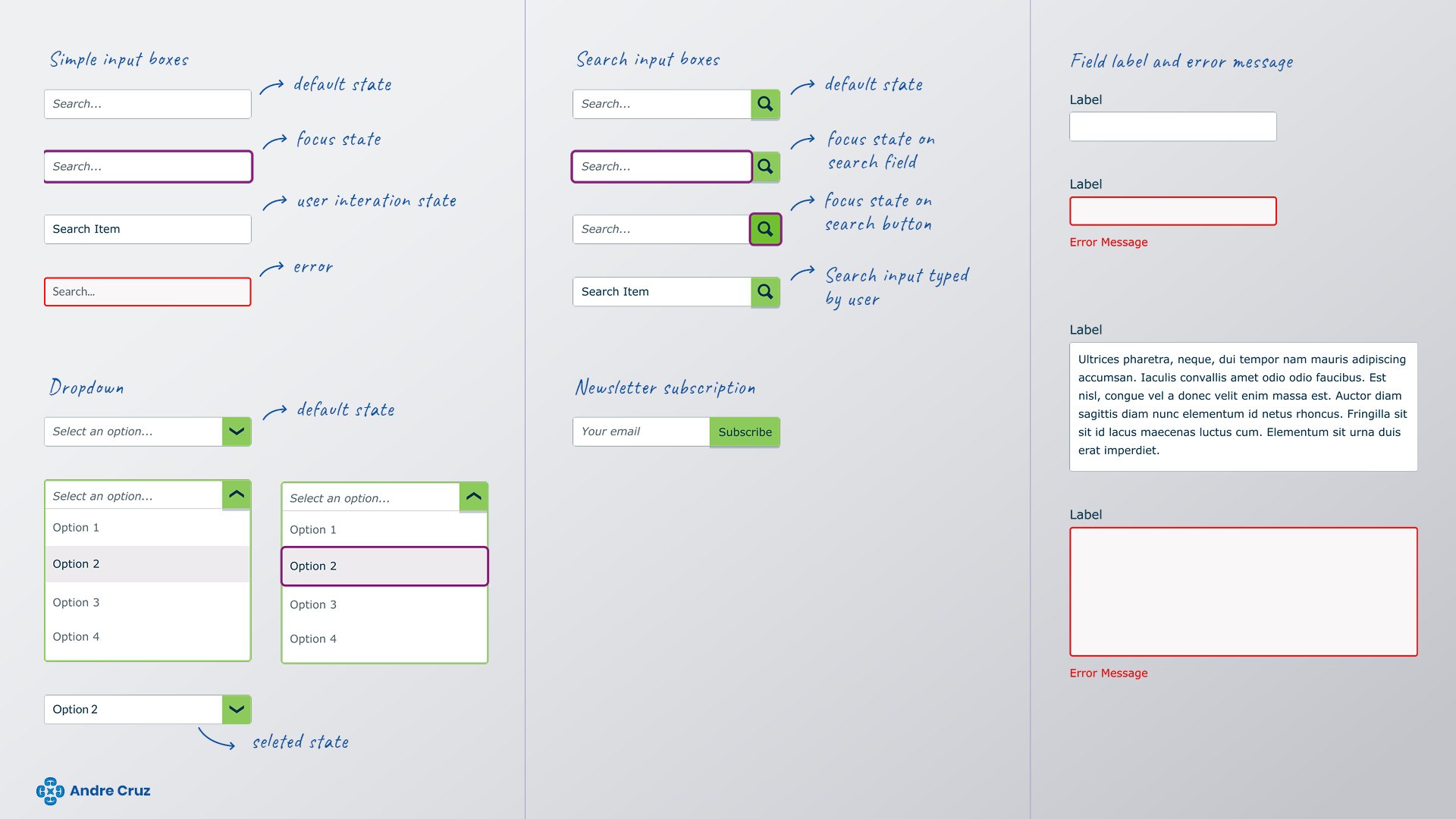
Input boxes
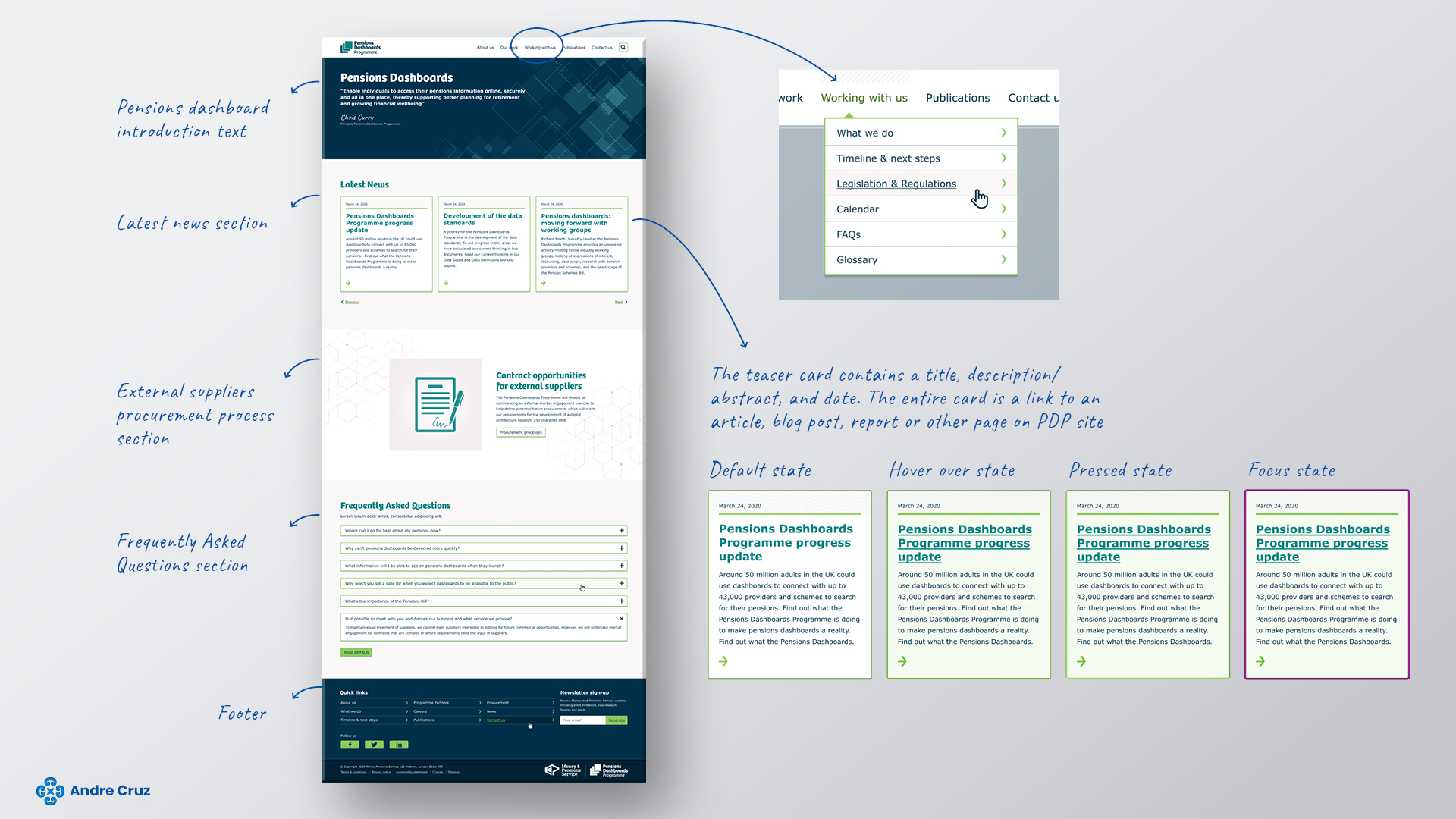
Home page
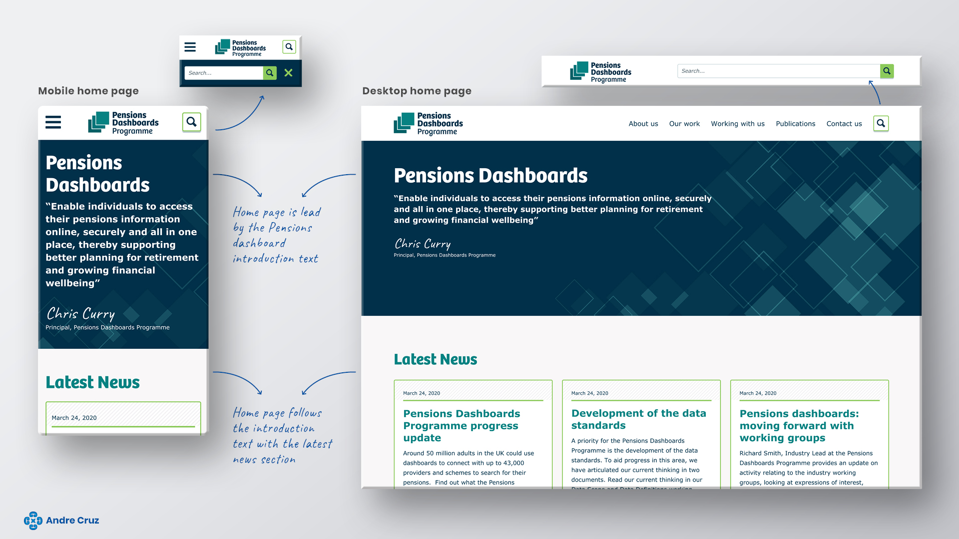
Home page structure
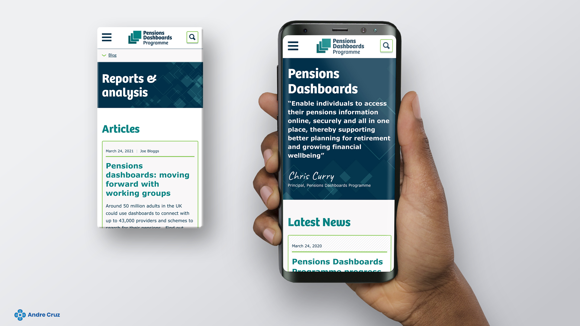
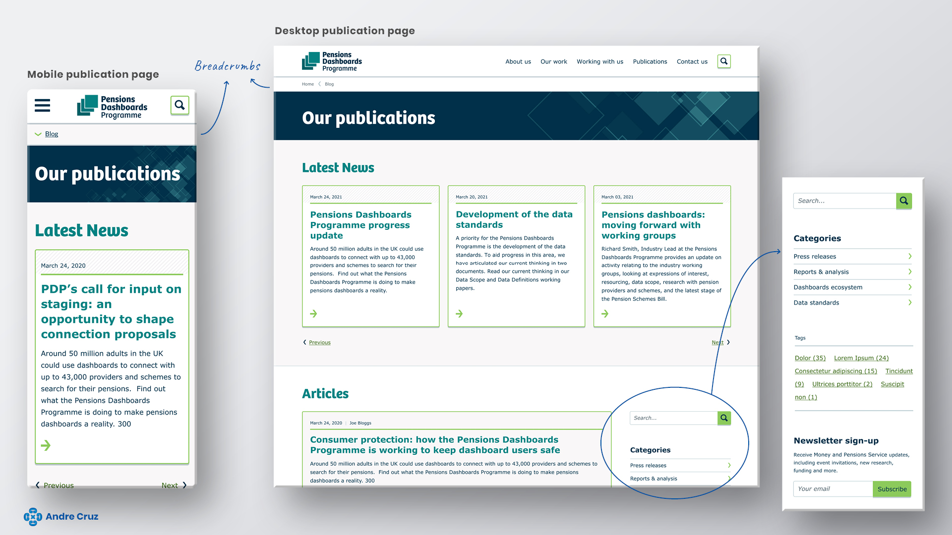
Publication home page
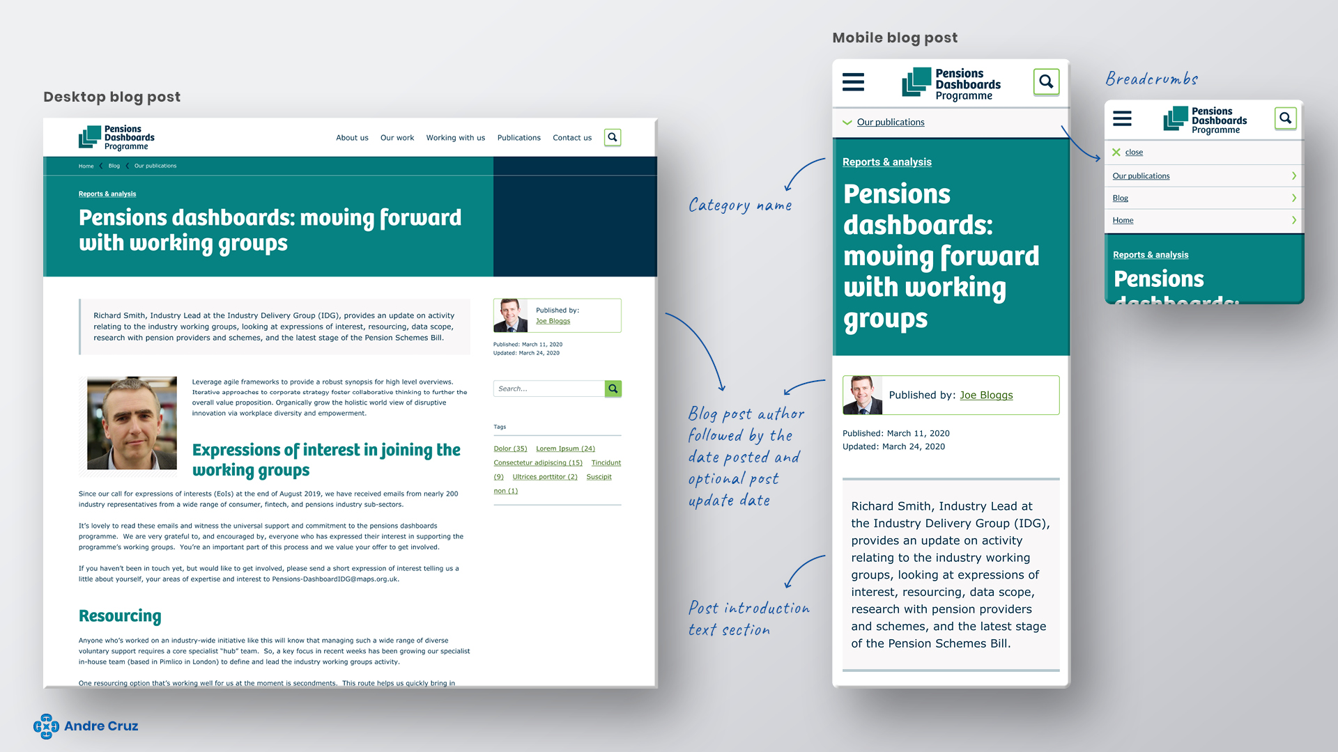
Blog post page
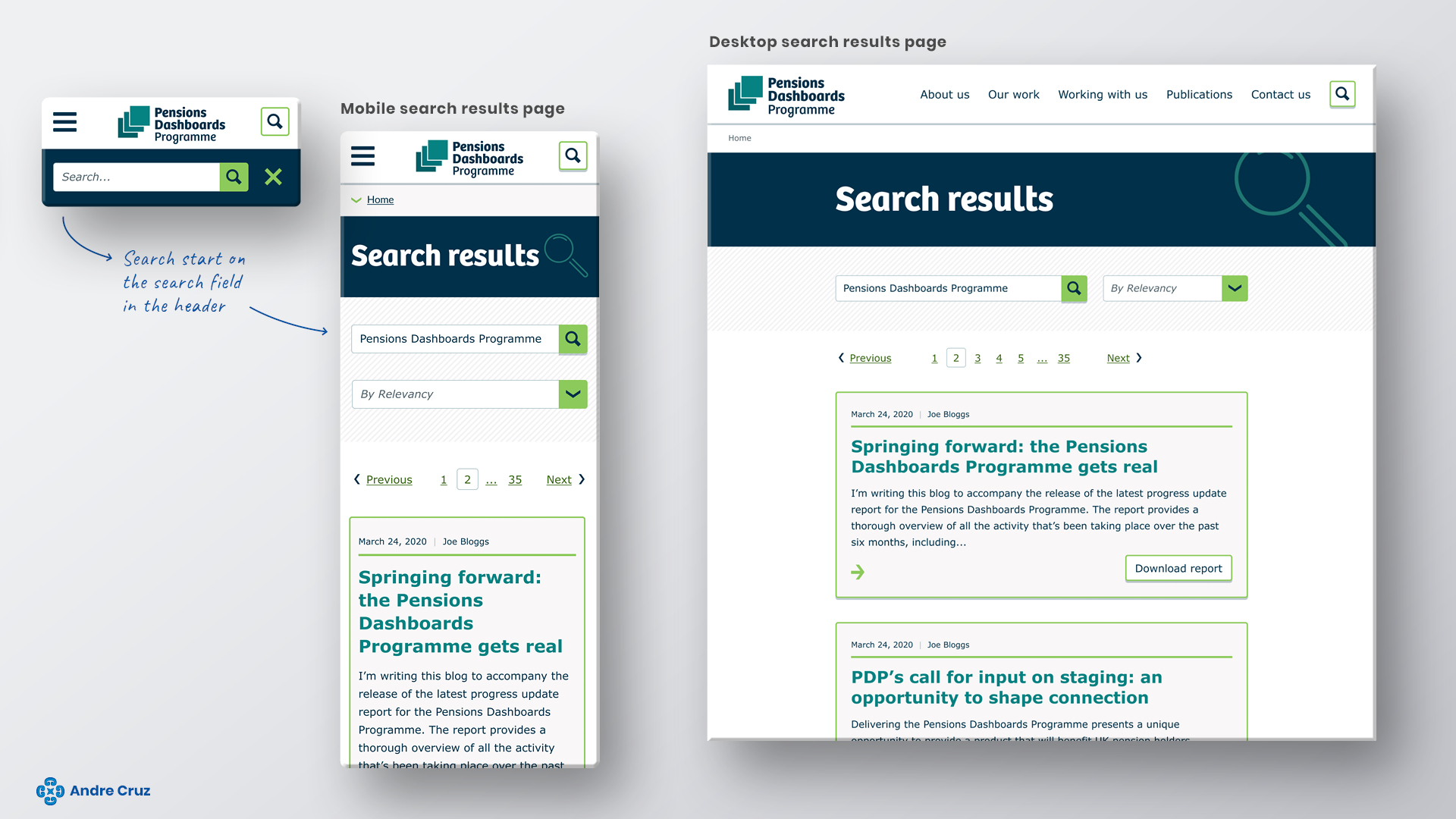
Search results page