2024
Reducing friction at a critical decision point to unlock incremental bookings
This project was developed while working at Co-op Legal Services, focusing on improving the booking experience within the will consultation booking journey. At the point of selecting a consultation date, users have already invested time and intent, making any booking drop-off particularly critical.
The aim was to redesign the booking page and underlying booking system to reduce friction, improve clarity, and increase completed bookings, with a strong focus on mobile performance. The work combined data analysis, journey mapping, design exploration, and user testing to validate new approaches before progressing to live experimentation.
Objectives
The primary UX objectives for this project were:
- Reduce friction and cognitive load Users arrive at the booking step ready to act, not explore.
- Increase completion and conversion Success measured by booking completion rate and drop-off per step.
- Build trust and confidence Booking involves money, time, and personal information, requiring reassurance and transparency.
- Improve clarity Users should clearly understand availability, pricing, and next steps.
- Optimise for mobile-first use Mobile performance represented the largest opportunity for impact.
- Ensure accessibility and inclusivity Designs aligned with WCAG 2.1 AA standards.
Key challenges
- 19% drop-off at the booking step
- High meeting cancellation rates, particularly within 48 hours
- Mobile users underperforming compared to desktop
- Friction occurring late in the journey, despite high user intent
This level of abandonment was especially concerning given that users had already completed the will creation flow.
Discovery and data analysis
To understand the problem space, I reviewed a combination of behavioural and performance data, including:
- Days between lead submission and booking date
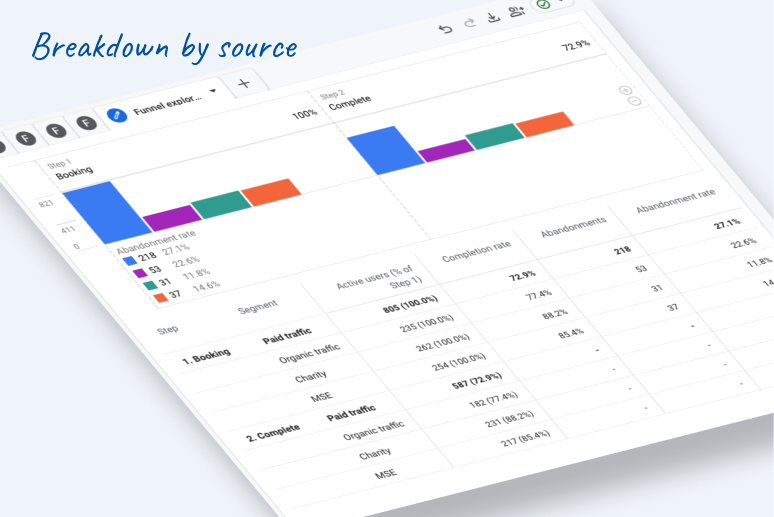
- Device breakdown and source breakdown
- On-page interaction metrics
- Booking page loading times
Key insights
- 1 in 4 users abandon the booking process
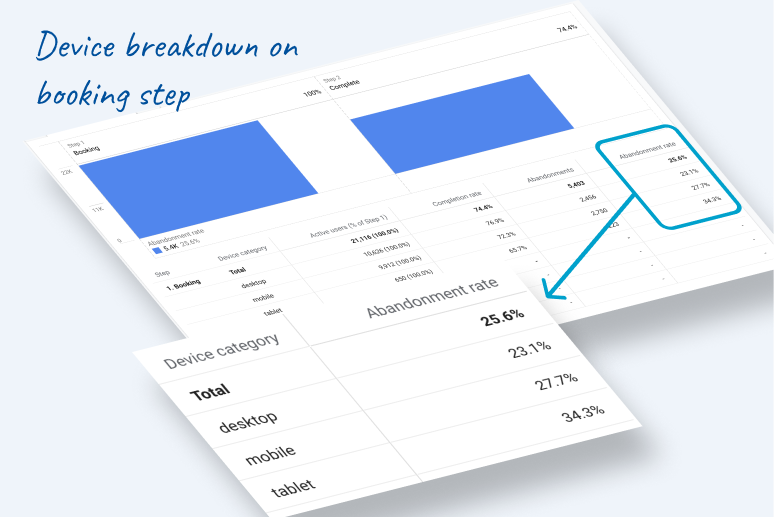
- Mobile abandonment is 4.6% higher than desktop
- Tablet performs worst overall
- Mobile users show 27.7% abandonment vs 23.1% on desktop
- Even a 5% uplift in mobile booking completion could translate into hundreds of additional bookings per month
These insights pointed clearly towards mobile-first optimisation as the highest-impact opportunity.
Journey mapping

I mapped the end-to-end journey to better understand user behaviours, expectations, and friction points. This highlighted that the booking step represented a critical moment of decision-making, where uncertainty around availability, pricing, and scheduling flexibility contributed to drop-off.
Opportunities identified
- Reduce abandonment and improve completion
- Make it easier to choose a time slot
- Introduce clearer calendar-based patterns
- Ensure pricing transparency at the point of booking
- Make it easier to rearrange appointments scheduled more than 48 hours in advance
- Improve clarity around available days versus weeks
Benchmarking and best practices
I reviewed industry examples and booking best practices across sectors such as travel, healthcare, and professional services. This helped establish proven patterns around calendar layouts, slot selection, urgency cues, and mobile interaction models.
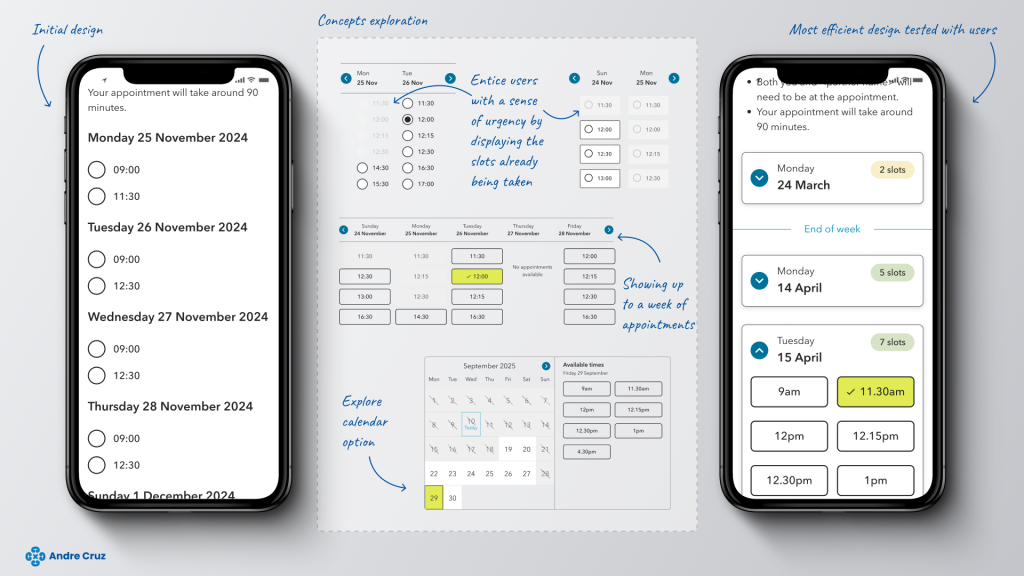
Concept exploration
A concept book was created to explore multiple booking models and interaction patterns.
Concepts explored
- Weekly appointment view
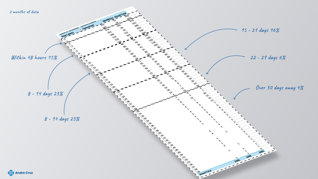
Showing one to two weeks of appointments aligned with observed user behaviour:- 51% booked within the first week
- 23% within the second week
- Days first, then hours
Reduced cognitive load but proved less effective when limited availability existed. Rejected as a primary solution. - Calendar-based layout
A familiar, visual format allowing users to quickly compare dates and availability. Strong candidate due to clarity and efficiency. - Urgency cues
Displaying slots already being taken introduced subtle scarcity, encouraging faster decisions without being aggressive. - Price visibility
Clear price display addressed repeated user frustration and improved trust and confidence. - Pre-selected dates
Tested as a concept but rejected due to risk of misalignment with user intent.
Ideation and design exploration
I designed multiple booking concepts to explore layout, interaction, and navigation patterns. This included:
- Horizontal day navigation with visible slot availability
- Variations highlighting booked versus available slots
- Buttons versus radio buttons for mobile optimisation
Early designs showed multiple days at once, which could be misinterpreted as a full week. This was refined by clearly marking week boundaries and improving visual hierarchy.
The original horizontal scroll approach worked better on mobile but disadvantaged desktop users. To resolve this, I explored layouts favouring vertical scrolling, improving consistency across devices.
The final concept explored a traditional month calendar, which proved strongest for clarity, predictability, and user confidence.
User testing and validation
Initial unmoderated testing compared radio buttons versus buttons. Buttons were clearly preferred.
Further unmoderated testing included:
- 8 mobile users
- 10 desktop users
- Three booking design options
Key findings
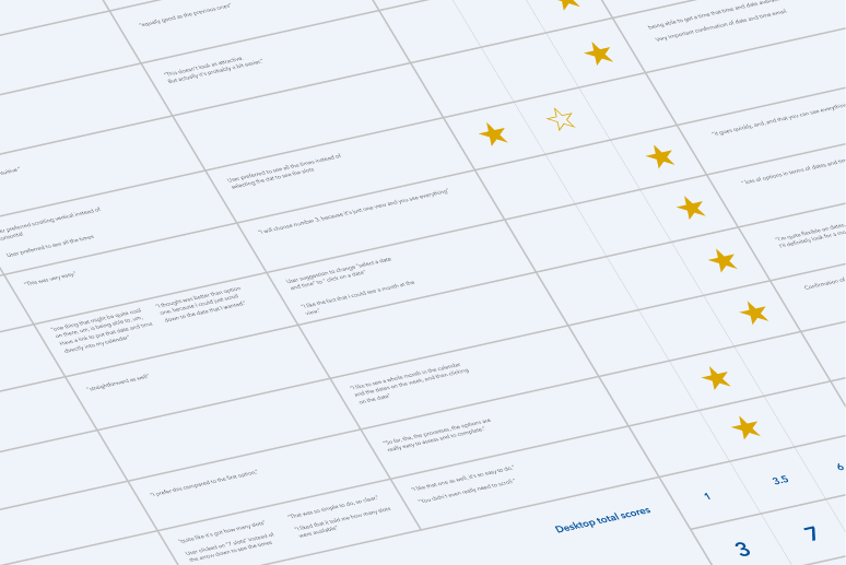
Option 1
- Poor mobile navigation
- Weakest desktop performance
- Perceived as outdated
Option 2
- Clean and easy to scan
- Strong second choice across devices
- Positive feedback on confirmation messaging
Option 3
- Preferred on mobile and desktop
- Strongest clarity of available days
- Most polished and confidence-inspiring
Option 3 emerged as the clear winner across both platforms.
Implementation plan
With a validated design direction, the project was prepared for live A/B testing.
To manage development complexity, implementation was split into two phases:
Phase 1
- Day accordions
- Improved navigation
- Clearer week structure
Phase 2
- Slot visibility enhancements
- Time slots as buttons
- Improved clarity and usability
This phased approach allowed incremental value delivery while supporting future optimisation.