2025
Evidence-led UX optimisation resulting in 677 additional annual plan sales for Co-op funeral plans
This project was developed while I was working at Co-op, within the Funeralcare department, where I collaborated closely with a cross-functional team including developers, the project owner, other designers, and the CRO manager.
The goal of this project was to increase the conversion rate of purchasing a funeral plan online through a series of targeted optimisation initiatives. These included both test-and-learn experiments and direct design improvements focused on reducing friction in the purchase journey.
Analysis showed a significant performance gap between desktop and mobile users, highlighting a clear opportunity to improve the mobile experience and unlock additional commercial value.
Problem statement
Customers entering the funeral plan purchase funnel on desktop were four times more likely to complete their purchase than those using mobile devices. This disparity strongly suggested that the mobile experience introduced unnecessary complexity and friction, preventing users from progressing confidently through the journey.
Improving the mobile funnel presented a high-impact opportunity to increase completed purchases and overall revenue.
My role
I worked as a UX Designer on this project, leading the end-to-end optimisation of the mobile funeral plan purchase journey. My responsibilities included analysing performance data, identifying key drop-off points, conducting competitor and best-practice reviews, mapping the user journey, and defining high-impact UX improvements.
I designed and prototyped alternative funnel approaches, collaborated closely with product, analytics, and development teams, and supported user testing and experimentation through A/B testing to validate design decisions.
Approach and methodology
Data-led discovery
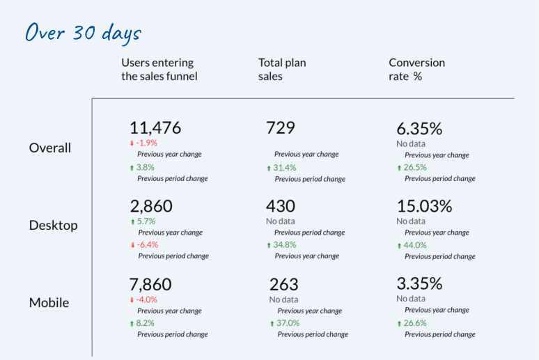
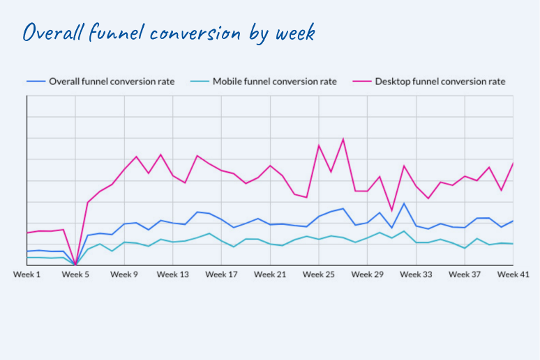
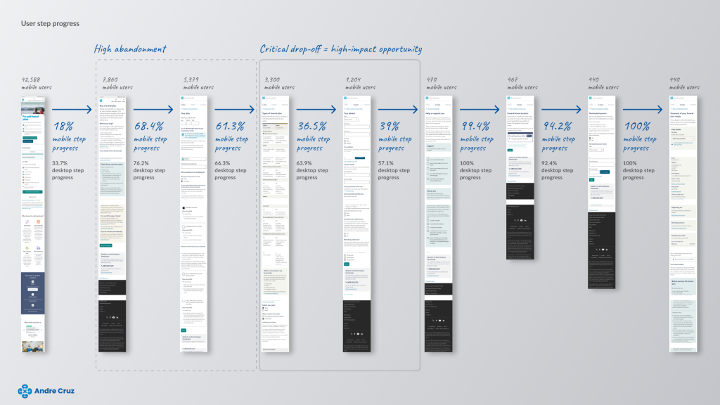
We began by reviewing existing analytics and performance data to identify key drop-off points within the mobile funnel. While mobile drove a higher volume of traffic into the funnel, desktop conversion was 4.5 times higher over the same 30-day period, with mobile conversion averaging 2.9 percent annually.
Competitive benchmarking
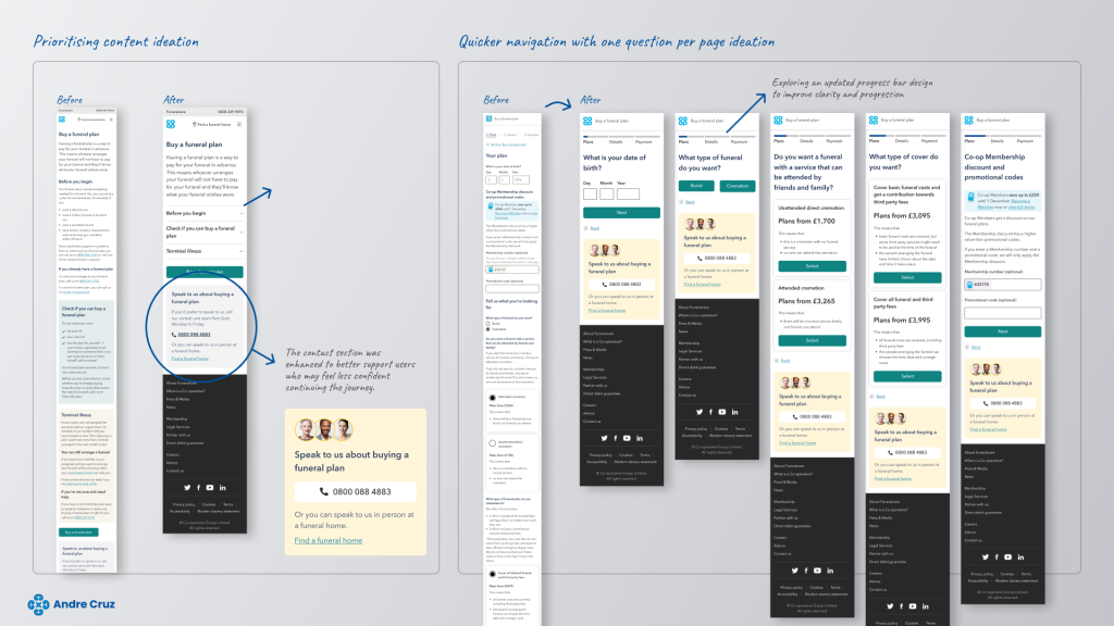
I analysed competitor journeys to establish benchmarks for best practice in mobile-first purchase flows. This surfaced clear patterns around content prioritisation, interaction design, and progressive disclosure, particularly the effectiveness of presenting one question per page to reduce cognitive load.
Journey mapping
Using the data insights, we mapped the end-to-end mobile journey to identify user needs, friction points, and high-impact opportunities. Pages with the largest traffic drop-offs were prioritised for redesign.
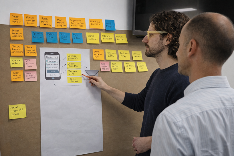
UX critique and content review
A detailed critique of the existing funnel highlighted excessive content density and multiple questions per page as key contributors to cognitive overload and abandonment.
Ideation and prioritisation
Ideas were generated collaboratively and evaluated based on potential user impact and commercial value. The strongest opportunity identified was simplifying each step of the journey by reducing content per page and focusing on a single decision at a time.
Design solution
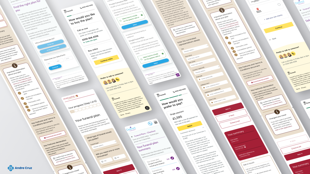
Aligned with industry best practice, I redesigned the funnel to present one question per page, creating a longer but significantly more digestible journey. While this increased the number of steps, it reduced cognitive effort, improved clarity, and was designed to feel simpler and more supportive for users making a sensitive and high-consideration decision.
The hypothesis was that this approach would reduce abandonment and increase completion rates by making progress through the funnel feel easier and more manageable.
Prototyping and validation
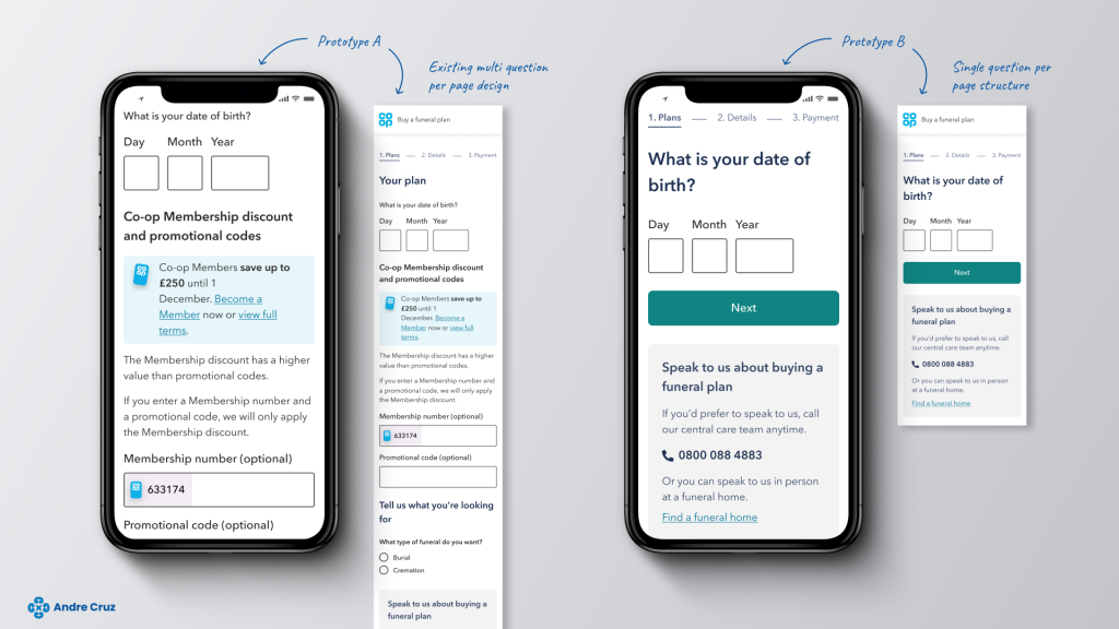
To validate the approach, I created two interactive prototypes:
- A baseline version reflecting the existing multi question per page design.
- A revised version using a single question per page structure.
These prototypes were used for user testing to assess comprehension, perceived effort, and confidence in progressing through the journey.
Experimentation and measurement
Following user testing and qualitative validation, the redesigned mobile funnel was rolled out as an A/B test against the existing experience. The experiment ran for 130 days, allowing sufficient time to reach statistical significance and account for natural variations in traffic and user behaviour.
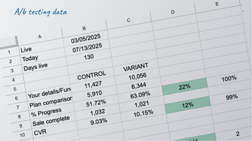
Performance was measured primarily on completed purchases, alongside supporting metrics such as step progression and abandonment rates. The results showed a clear and sustained uplift in mobile conversion, with the new design delivering 241 additional completed purchases during the test period. These findings provided strong quantitative evidence that reducing cognitive load and introducing a single question per page structure significantly improved user progression and confidence within the funnel.
The robustness of the results supported confident decision-making for wider rollout and informed future optimisation efforts across similar high-consideration journeys.
Impact
The redesigned mobile purchase journey was validated through A/B testing over a 130-day period, until results reached statistical significance. During this time, the new design delivered an increase of 241 additional completed purchases compared to the existing experience. When projected over a full year, this uplift equates to an estimated 677 additional funeral plan sales, representing approximately £1.6 million in incremental revenue.
Beyond the commercial impact, the project demonstrated how reducing cognitive load and simplifying decision-making in a high-consideration journey can significantly improve user confidence and progression on mobile. The work established a scalable, evidence-based approach to optimisation that could be extended across other areas of the site and future product initiatives.