2020
Crafting seamless experiences in UI design system & brand development
Money and Pensions Service (MaPS) emerged as a unified entity, amalgamating three consumer-facing brands: the Money Advice Service, The Pensions Advisory Service, and Pension Wise. This consolidation aimed to streamline financial guidance services and content, simplifying the customer experience by offering comprehensive services under one roof.
By merging these three brands into one, MaPS revolutionized consumer interaction, creating a singular hub for information and guidance. Now, customers can effortlessly access a wealth of resources in one centralized location. This unified approach enhances the overall consumer experience, providing easily accessible and consolidated financial information.
Introducing our new consumer-facing brand: MoneyHelper.
Project assignments and responsibilities:
- Establishing and enforcing MoneyHelper brand and digital guidelines consistently throughout the organization.
- Leading the User Interface strategy and designs, focusing on usability and accessibility standards (WCAG 2.1 AA).
- Transforming legacy tools through reskinning, enhancing both UX and UI for an improved user experience.
- Ensuring meticulous design quality control and its ongoing maintenance.
- Developing a robust design system and comprehensive design library documentation.
- Crafting prototype specifications and defining essential design assets.
- Collaborating closely with both front-end and back-end development teams to ensure swift and efficient product releases.
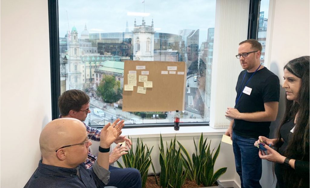
Participating in collaborative workshops to establish clear objectives for the new platform.

Gaining Deep User Insights
We analyze user behaviors and preferences, creating detailed personas and pinpointing key pain points. This sharp focus guides us in crafting precise, user-friendly solutions.
Envisioning Future Capabilities
Strategizing the desired features and functionalities for our customers.
Priority Focus
Aligning with the MVP vision, we prioritized essential capabilities and short-term features.
Diverse Perspectives
Representing diverse business sectors and future platform users, ensuring holistic viewpoints.
Insights from discovery phase

The new platform must incorporate a flexible structure, including:
- Clear taxonomy and tagging for easy content searchability within the website and search engines.
- Consistent look and feel across various content and features.
- Compatibility for implementing legacy tools and calculators.
- Compliance with WCAG 2.1 AA web accessibility standards.
We embraced Adobe Experience Manager (AEM) utilizing a modular component approach. Content fragments enable the incorporation of specific content types needed for the site. The page’s fundamental structure includes global navigation (header and footer), secondary navigation (side columns), and a designated area for the main content.
Grid system
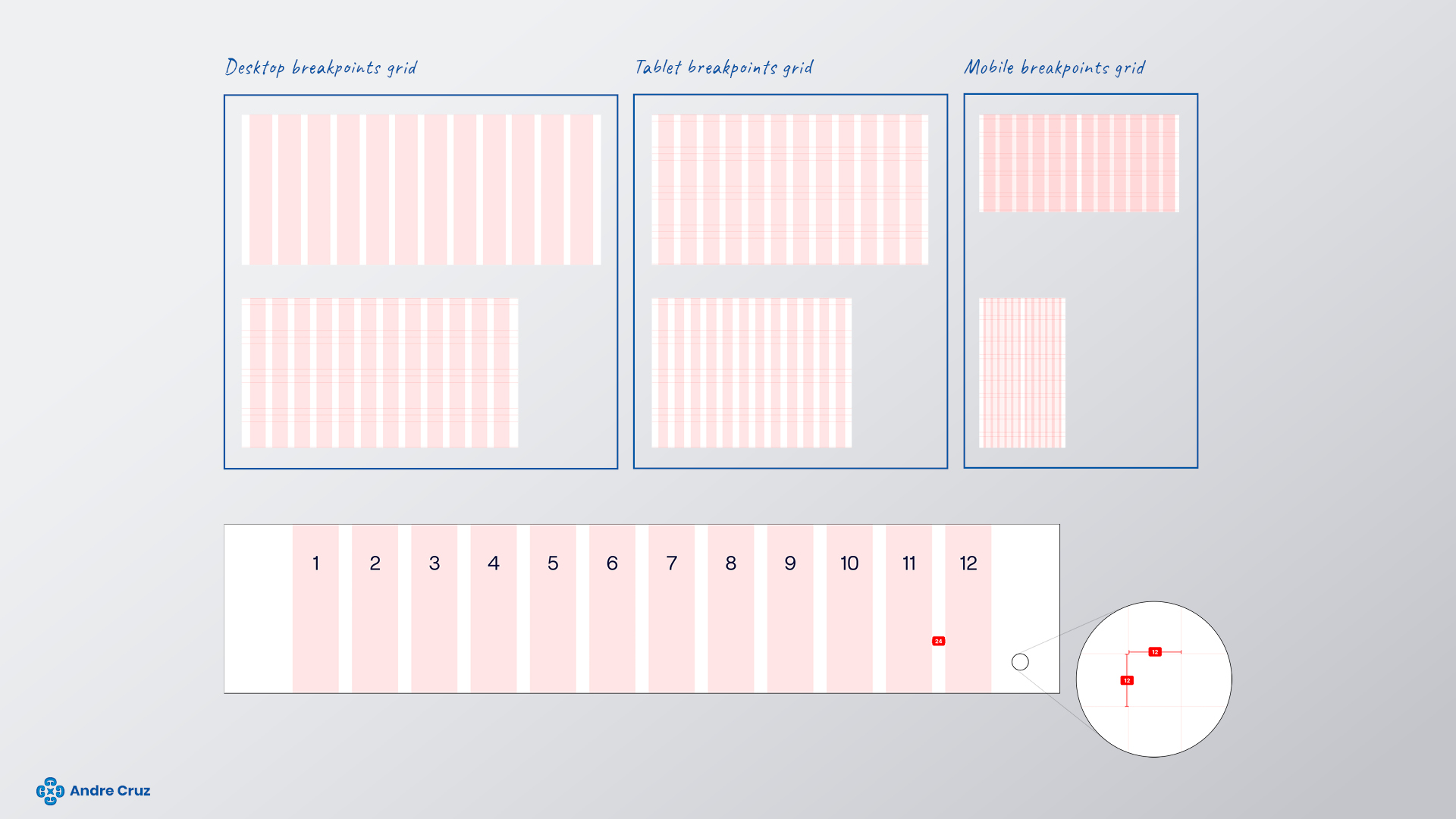
A flexible grid with percentage-based columns, fixed margins, and gutters provides adaptability in layout design, optimizing space utilization for a seamless and visually appealing interface.
320–740 mobile
12 Columns, gutters 16, margins 16.
741–1024 tablet
12 Columns, gutters 24, margins 24.
<1025 desk/laptop
12 Columns, gutters 24, margins 32 (page content width limited to 1272px).
Colour palette
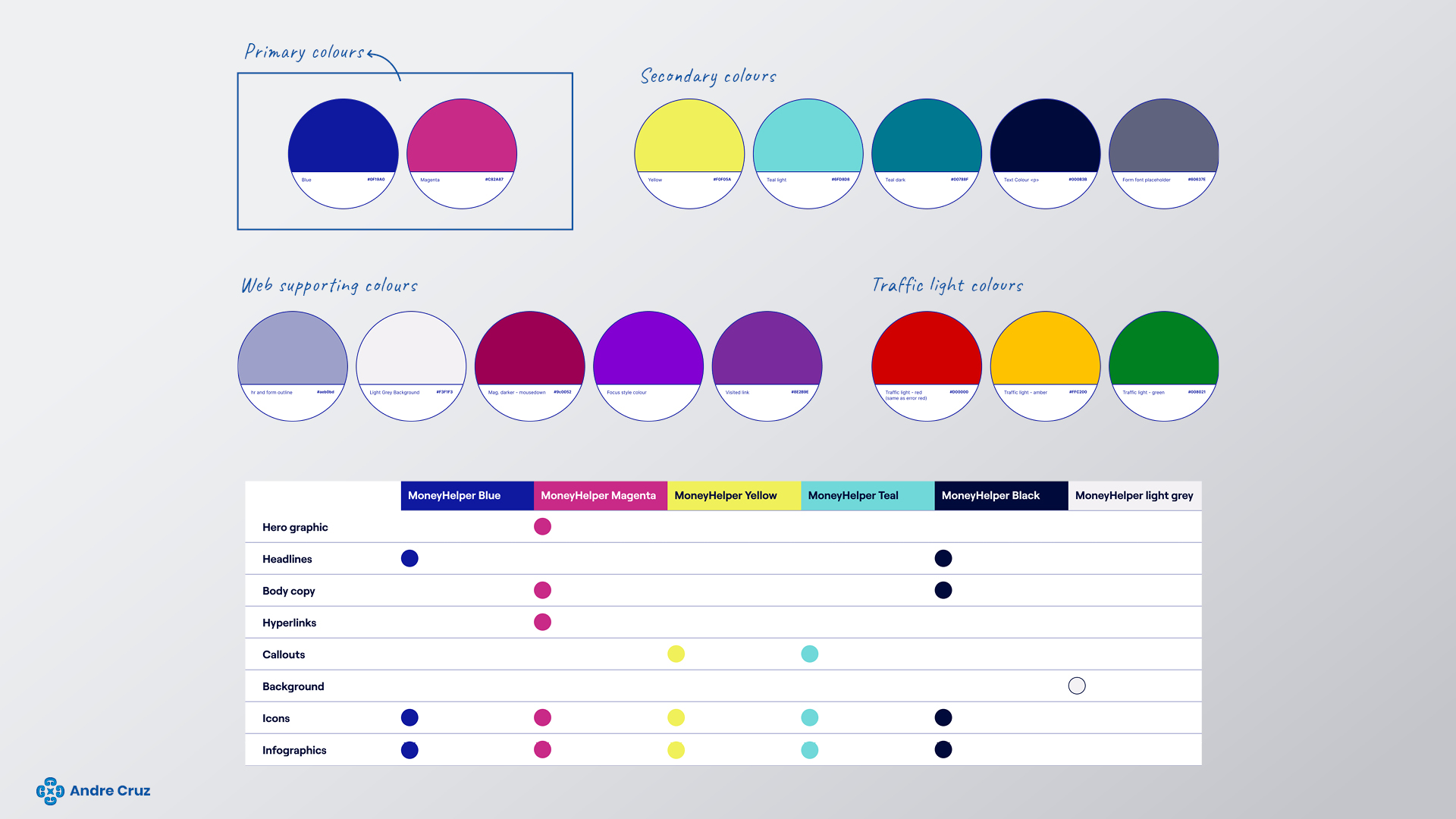
MoneyHelper’s distinctive color palette pulsates with vibrancy, boldness, and unbridled optimism. Each hue is meticulously chosen to evoke a sense of energy and positivity. These lively shades not only captivate attention but also empower and inspire, reflecting the very essence of MoneyHelper’s brand identity.
Through this vibrant spectrum, MoneyHelper communicates its unwavering commitment to empowerment, financial well-being, and a brighter future for all.
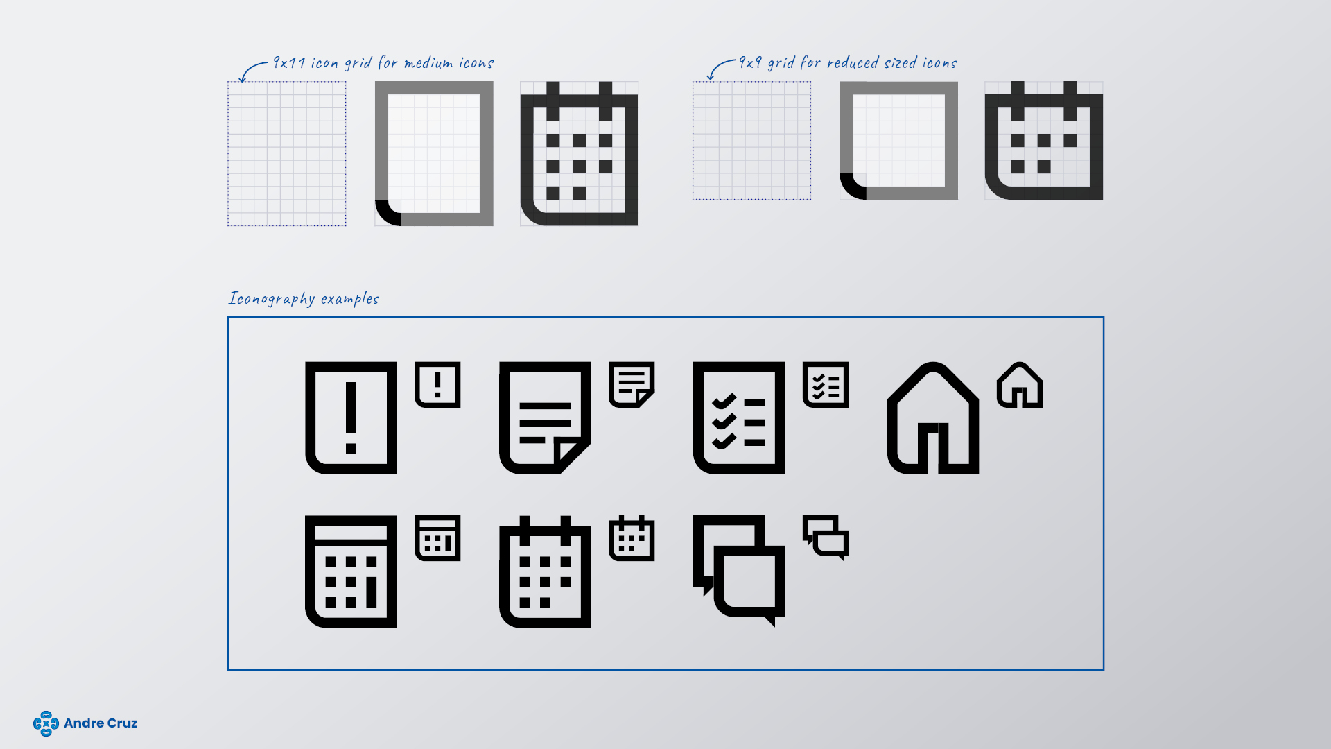
Iconography
MoneyHelper’s icons are meticulously crafted to be clear, concise, and elegantly outlined, embodying simplicity and sophistication. Each icon is thoughtfully designed to convey information in a visually intuitive manner, ensuring effortless communication with the users.
Additionally, I maintain deliberate consistency in the design approach – utilizing rounded bottom left-hand corners across all icons. This unified design element not only aligns seamlessly with the brand’s aesthetic but also enhances the overall visual harmony. It serves as a subtle yet impactful touch, reinforcing our commitment to a cohesive and user-friendly experience.
Through this attention to detail, MoneyHelper’s icons not only communicate information effectively but also enhance the overall visual appeal of our interface, contributing to a seamless and delightful user journey.
Typeface
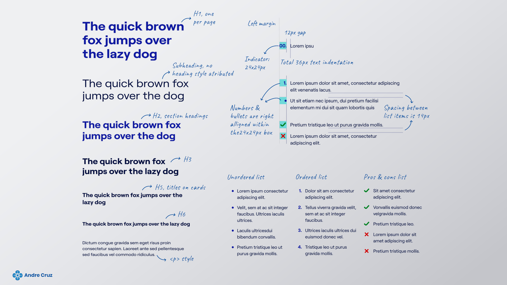
We rely on Roobert as our primary font, harnessing its diverse family of multiple weights. The Regular variant is employed for body copy, ensuring clear and readable text, while the bold weight commands attention in headlines, enhancing visual hierarchy and impact.
For scenarios where Roobert is unavailable, we seamlessly transition to our secondary typeface, Calibri. This versatile font finds its application in various contexts, including office documents such as Word, PowerPoint, and emails. This careful selection ensures consistent readability and a unified typographic identity across our communication channels.
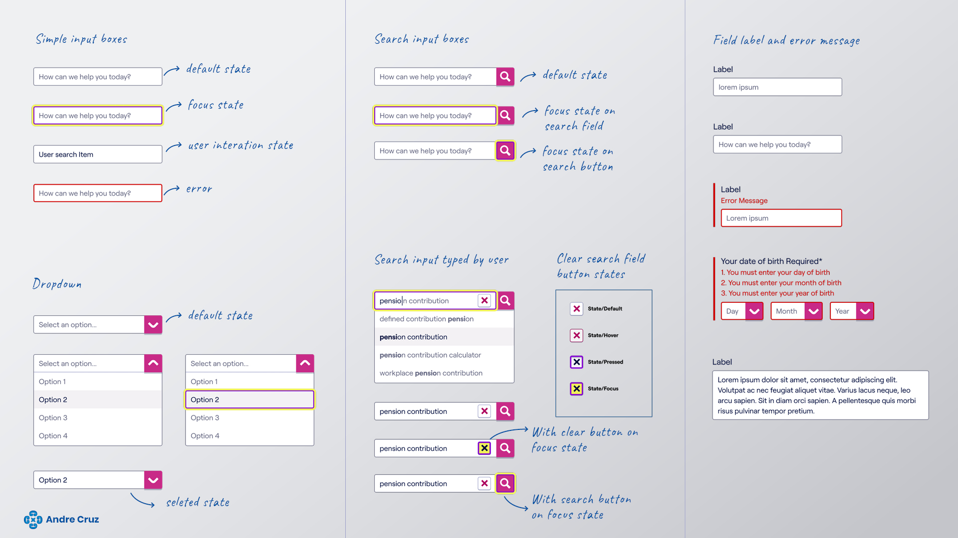
Links

Buttons
The vibrant MoneyHelper magenta color is strategically employed as our prominent call-to-action hue, capturing immediate attention and guiding user actions effectively.
The design system follow a specific principle for call-to-action elements. A primary button style serves as the central focal point on each page, ensuring a singular, clear action prompt. Avoiding the use of multiple primary buttons on a single page is crucial, as it maintains the impact of the main call to action and prevents user confusion regarding the next steps.
Additionally, I designed a distinct secondary button style for secondary calls to action, enhancing the clarity of hierarchy and user interactions across the platform.
Hyperlinks
Hyperlinks are highlighted in the vibrant MoneyHelper magenta colour, serving as the designated call-to-action hue. These links are meticulously designed with multiple states to ensure compliance with the WCAG 2.1 AA web accessibility standards. By incorporating various states, such as hover and focus effects, it guarantee an inclusive and user-friendly experience for all our visitors, reinforcing our commitment to accessible design.
Input boxes
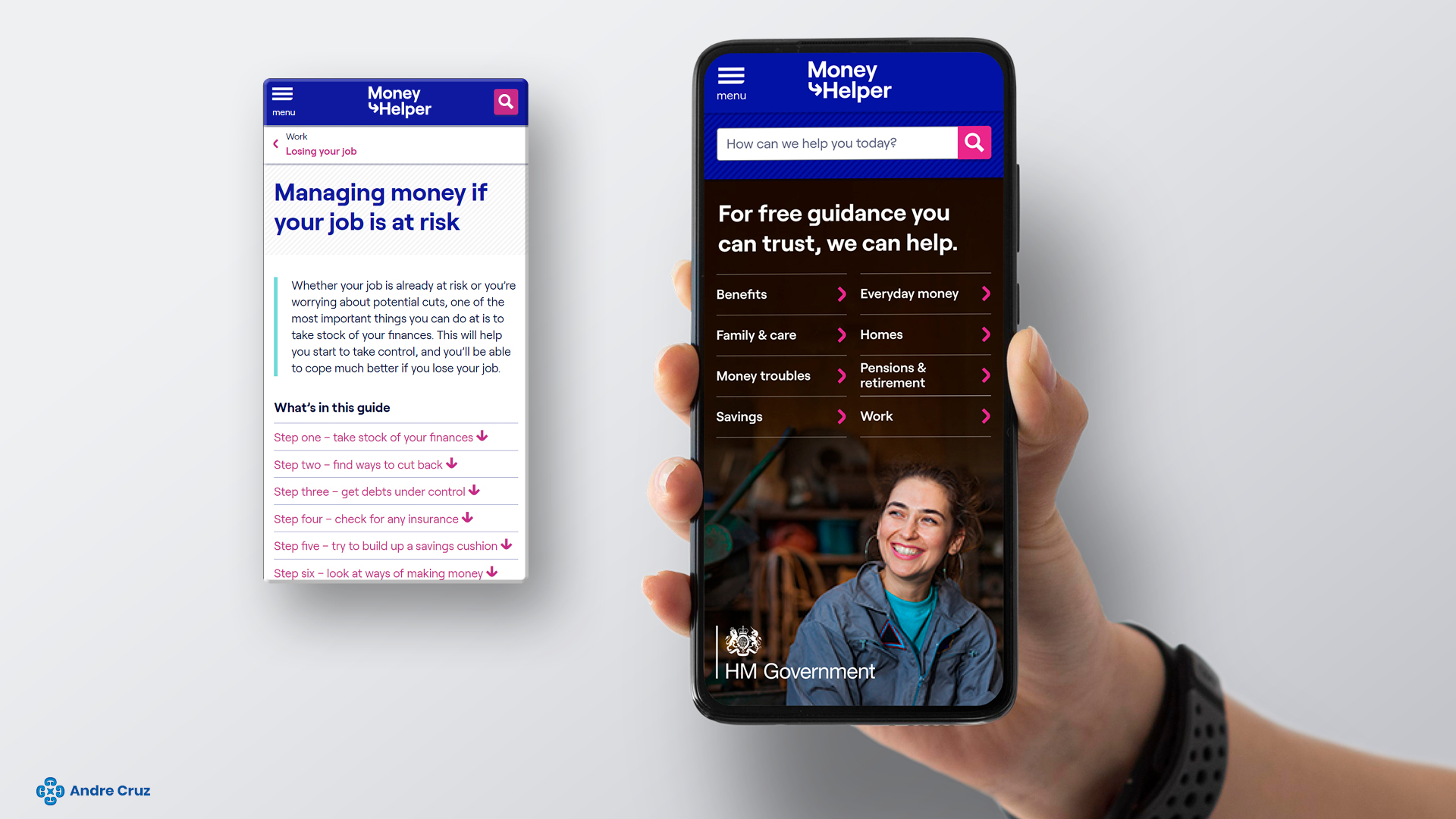
Home page (level 0)
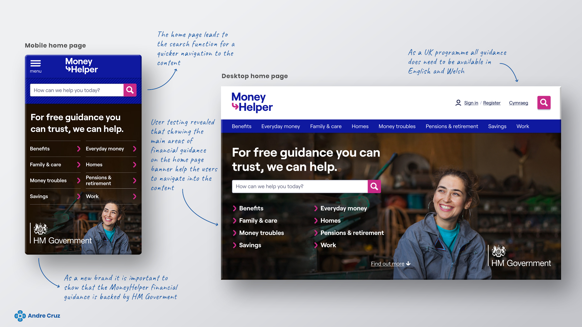
Home page structure
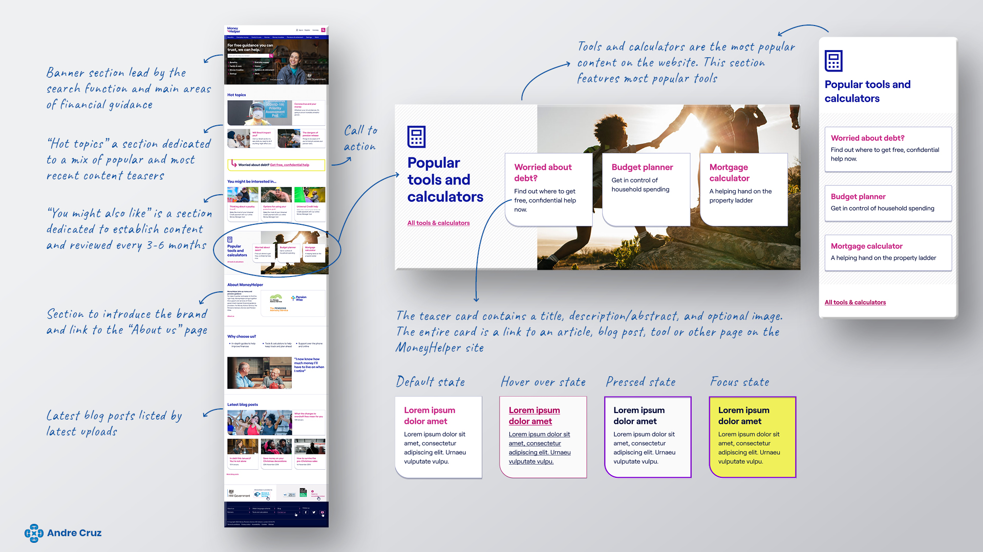
Contact component

The contact component offers a unified and seamless method for customers to connect with MoneyHelper for guidance through various channels, including web chat, telephone, online forms, WhatsApp, and postal mail.
Users can access this feature effortlessly via a floating action button positioned on the right-hand side of the browser viewport. This button remains ‘sticky,’ ensuring its continuous presence across all pages of the website.
This intuitive design choice empowers users to reach out for assistance conveniently, enhancing their overall experience with MoneyHelper’s support services.
Article page
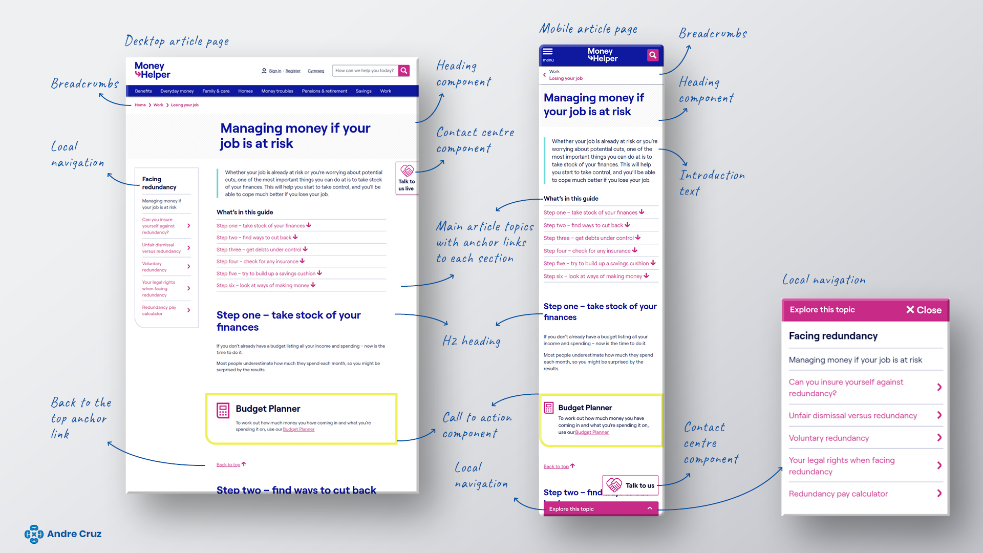
With a flexible structure adopting a modular approach to components, our article pages offer the versatility to incorporate diverse content fragments, enhancing the depth and richness of user experience.
Local Navigation Component
One notable feature is the ‘Local Navigation Component,’ a user-friendly tool empowering visitors to seamlessly explore a curated collection or sequence of articles centered around a specific subject. This intuitive navigation feature ensures users can effortlessly navigate through related content, enhancing their understanding and engagement. This thoughtful design element underscores our commitment to providing comprehensive and user-centric information, elevating the overall usability of our platform.
Conclusion: empowering experiences, enriching journeys
In conclusion, my design journey for MoneyHelper has been driven by a passion for creating intuitive, accessible, and engaging experiences. Through meticulous research, thoughtful user-centric design, and adherence to accessibility standards, I have crafted a platform that empowers users on their financial journeys.
Your feedback is invaluable in shaping my ongoing efforts to enhance user experiences further. I invite you to share your thoughts, suggestions, or inquiries. I eagerly look forward to collaborating with you and making our future projects even better together.