
(What I’ve learned from real projects)
A design system is only useful if everyone can use it. Over the last few years I’ve helped create systems and complex interfaces for finance tools, pension dashboards and EV analytics platforms. In every case, accessibility (following WCAG 2.1 AA standards) was not just an add-on at the end, it was part of the foundation.
In this post I’ll share some simple lessons on how to make a design system that is both scalable for teams and usable for all people.
Why accessibility matters from day one
Accessibility is not just a checklist you tick before launch. It’s a way of thinking about design from the start.
- Colours and contrast. Your palette should already meet accessibility rules, so no one has to “fix it later.”
- Components with behaviour. Buttons, inputs and menus should already include things like keyboard navigation, focus states and clear error messages.
- Helpful documentation. Every component should come with examples, dos and don’ts, and notes on how it supports accessibility.
When we built the MoneyHelper design system, for example, setting strong rules for colour and text contrast made it much faster to design and develop accessible screens across the whole website.
Start small: use tokens
Tokens are just small design rules, written in a way both designers and developers can understand. Think of them as the “DNA” of your system.
Examples:
colour.text.main,colour.bg.surface,colour.border.focusspacing.100,spacing.200type.size.large,type.size.small
If you design these tokens with accessibility in mind (for example, always meeting contrast ratios), then every component built on top of them is already inclusive.
Making components everyone can use
Every component (like a button or form field) should come with:
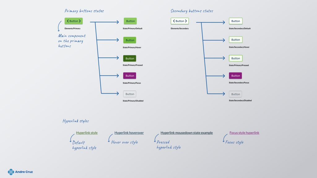
- States. Normal, hover, focus, error, disabled.
- Keyboard rules. What happens when you tab or press enter.
- Labels and roles. So screen readers can describe them correctly.
- Clear examples. Ready-made snippets for designers and developers.
For instance:
- A button should have only one “primary” style per screen, with a visible focus outline and a loading state.
- A text input should always have a clear label (not just placeholder text), and error messages that are linked to the field with screen reader support.
On projects like the Pension Finder, this approach was crucial because people needed to handle very sensitive information — mistakes or unclear errors would damage trust.
When data gets complex
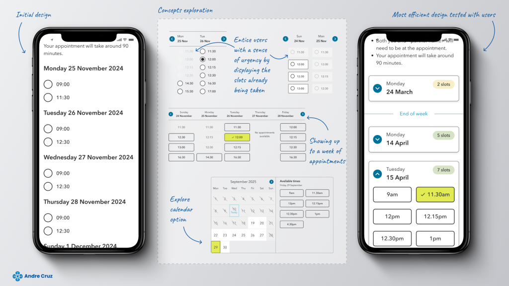
Some products, like dashboards or financial tools, involve heavy data. Accessibility here is about clarity:
- Show only the most important information first.
- Let people customise their view.
- Make charts and tables navigable with both mouse and keyboard.
- Provide helpful empty states (“No data yet” instead of blank screens).
On the Shell EV analytics project, simplifying the dashboards into a clear, consistent design made it easier for everyone to navigate and understand — while also making it easier for the team to maintain.
Keep your documentation simple
A design system is useless if no one reads the documentation.
- Write task-based guides (“How to build a form”) rather than long lists of components.
- Include examples in both Figma and code.
- Add quick accessibility reminders like “Don’t rely on colour alone.”
- Use simple menus and local navigation so people can find what they need.
When we did this for MoneyHelper, it reduced confusion and gave teams the confidence to design and code without second-guessing.
Sharing the responsibility
Accessibility only works if the whole team owns it.
- Run short weekly reviews of new components.
- Use automated tools (like Axe or Lighthouse) to check basics.
- Keep a changelog so people know when something has changed.
- Let product teams suggest improvements, but keep a small group in charge of final decisions.
This way, accessibility is not one person’s job — it becomes part of the team’s culture.
Quick wins you can try now
Here’s a starter checklist for any design system:
- Choose colours that already pass contrast tests.
- Define text sizes and spacing that work on all screens.
- Add focus outlines and keyboard rules to components.
- Write clear labels and error messages.
- Keep docs short, clear, and task-focused.
- Automate accessibility tests in your workflow.
Final thoughts
An accessible design system saves time, reduces bugs, and helps teams ship products that actually work for everyone. From my experience, the earlier you bake accessibility into the system, the easier it is to scale.
If you’d like to see some examples, check out my portfolio — I’ve applied these principles on real-world projects in finance, pensions and energy.