
The other day I joined a webinar by Mike Weir on behavioural science and how it can be used to improve website experiences. Honestly, it was packed with useful stuff, so I thought I’d jot down my favourite takeaways and examples.
It’s all based around the MINDSPACE framework (a set of principles the UK government developed to understand and influence behaviour). Sounds heavy, but it’s actually really practical for anyone designing websites.
Here’s what stuck with me:
1. The messenger matters
We don’t just listen to the message, we listen to who’s saying it. Authority, expertise, or just being likeable makes all the difference.
Example: Eve Sleep pulled in posture experts on their product pages. It gave their mattresses a sense of credibility you wouldn’t get if they just shouted “trust us, we’re great.”
2. Incentives aren’t just discounts
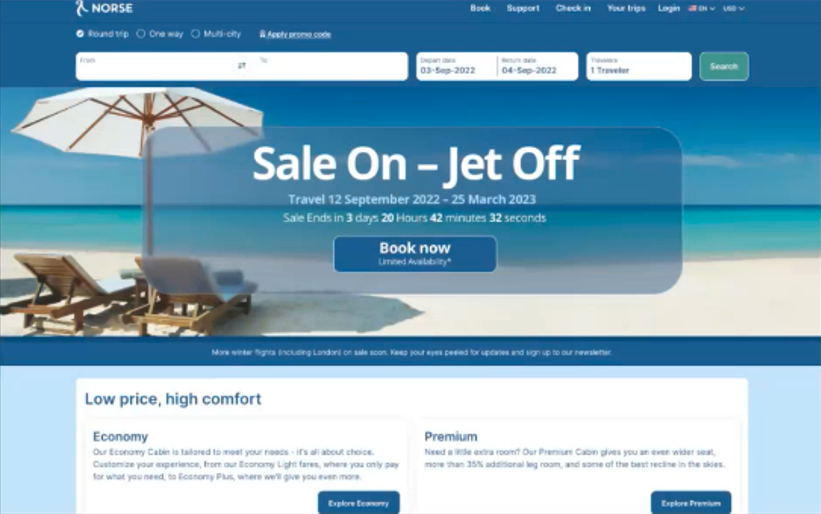
Sure, discounts work, but incentives can also be emotional. People hate missing out. That’s why a dreamy holiday beach pic can be as powerful as a “20% off” banner.
The trick is using them in the right context, urgency works fine for a travel site, but imagine a funeral site telling you “Only 3 coffins left!”… not cool.
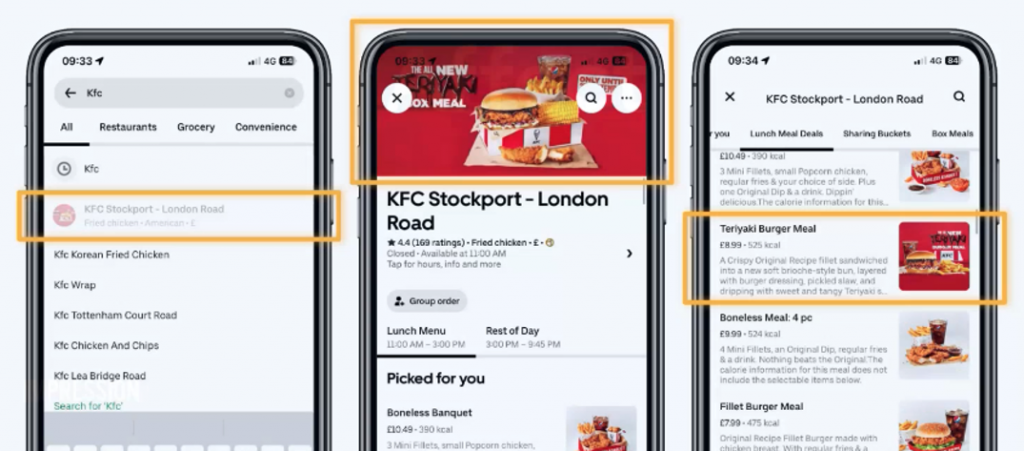
3. Norms shape what we do
We copy other people, especially when we’re unsure.
Example: An Icelandic car rental site highlighted “most popular” add-ons like Wi-Fi and GPS. People booked them more, but interestingly overall bookings went up too. Just seeing that others were doing it gave users confidence.
4. Defaults are powerful
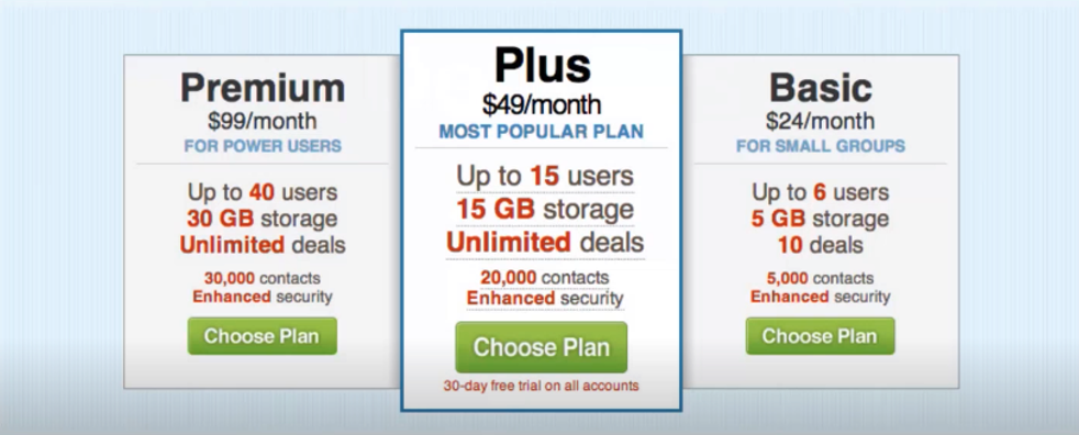
Most of us stick with the default option, whether it’s a ticked box or a pre-selected plan.
Example: Mike’s team started including research as a default in proposals. Clients rarely took it out, so uptake shot up, all because it was already “there.”
5. Make things stand out
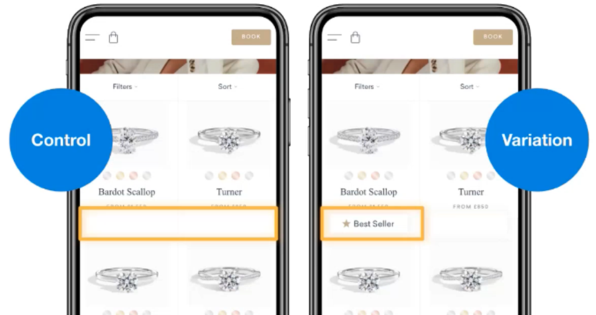
Our brains are lazy filters. If everything looks the same, we stop seeing it.
Example: A jewellery site slapped “bestseller” on one silver ring. That ring sold more… but sales of the rings near it also went up. The little label broke the monotony.
6. Feelings > facts
People remember how your site made them feel, not the exact details.
Example: A broadband provider kept apologising for roadworks. The constant negative framing left customers feeling rubbish about the brand. When they reframed it as “exciting upgrades,” complaints went down.
7. Small steps build momentum
If you can get someone to take one little action, they’re more likely to stick with the bigger one.
Example: Netflix just asks for your email first. Once you’ve done that, you feel nudged to “finish signing up.”
8. Ego drives choices
What we buy often reflects who we want to be.
Example: Rolex names its watches with themes linked to success and luxury lifestyles. People aren’t just buying a watch, they’re buying a story about themselves.
9. Priming works in the background
Sometimes just being exposed to an idea or image nudges you later.
Example: Keeping your ads and website imagery consistent helps keep your brand front-of-mind, so when users decide, you’re already in their head.
10. Do it ethically
All this stuff is powerful, but there’s a line. Just because you can use urgency, doesn’t mean you always should. The best way to check yourself? Ask: would I be okay if this was done to me?
What I took away
The big theme for me was that attention and emotion matter more than logic. People don’t decide by carefully weighing up all the options — they look for shortcuts, signals, and feelings. If you can design for that (without being manipulative), you make websites that people actually enjoy using.
As Mike said: marketing is psychology. And honestly, after this session, I don’t think I’ll ever look at a checkout flow or a “bestseller” badge the same way again.