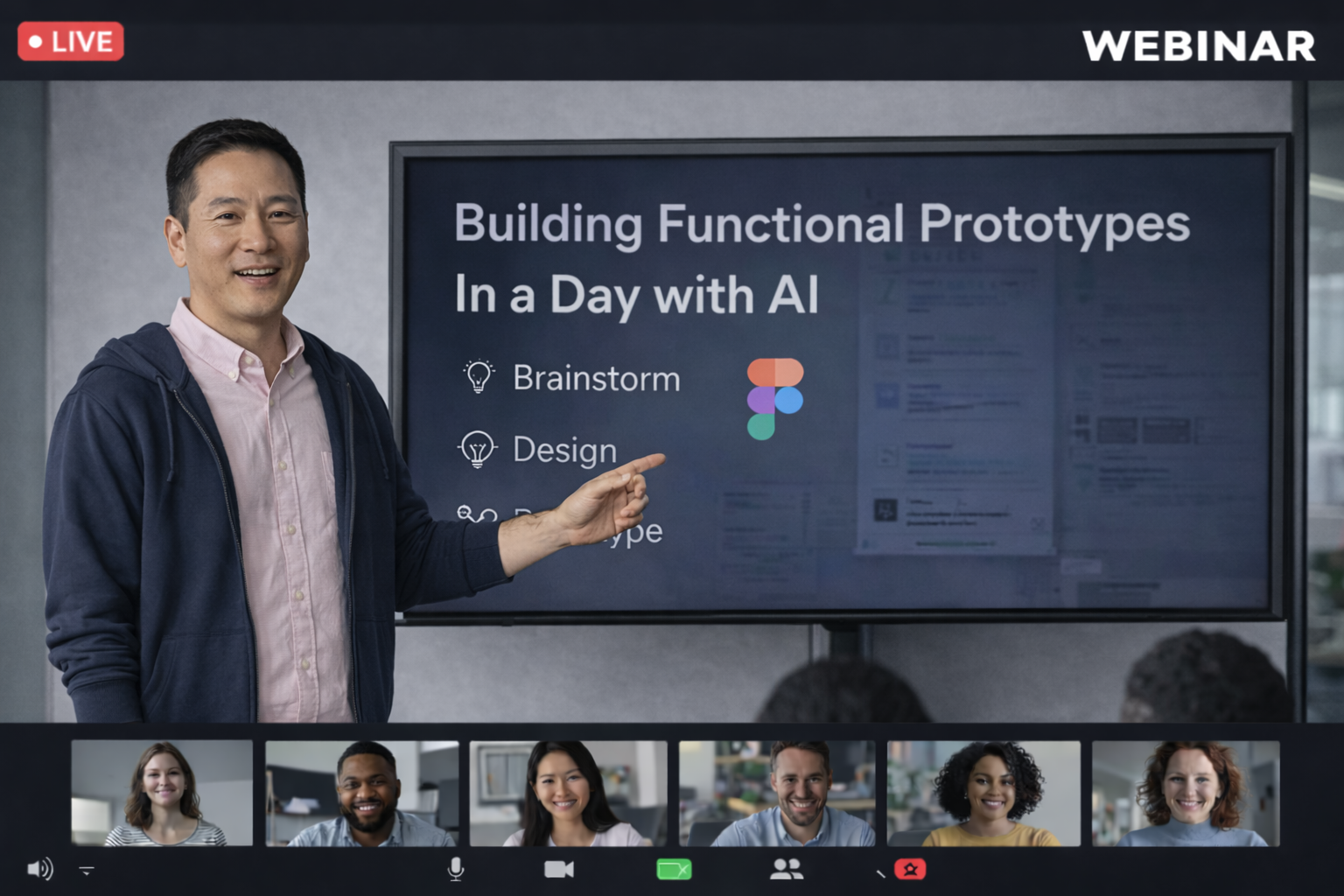
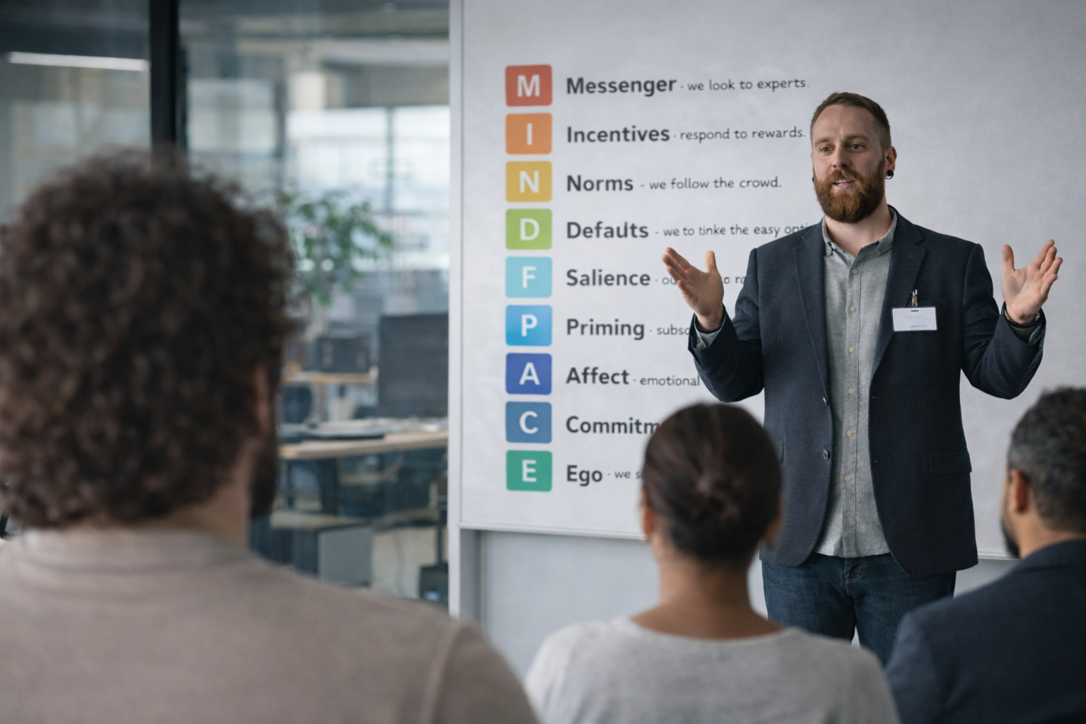
Building Functional Prototypes in a Day: How AI Is Changing the Way We Design

Functional Prototypes in a Day: How AI Is Changing the Way We Design

I recently joined a call with Jack Fletcher, a Digital Product & Design lead at Co-op, and WOW — what he showed us about using AI in the design process was genuinely exciting. Not “sci-fi hype” exciting, but real, practical, “designers can actually use this today” exciting.

And the best part?
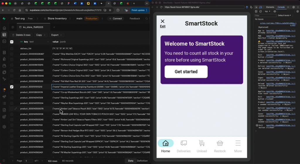
He built a fully coded, fully functional prototype of a stock-management app in under 24 hours — without being an engineer.

Yep. Wild.

Why he did it

Jack’s team is working on a new stock-management system for Co-op food stores. They expected to test the real app in-store by the end of the year… but delays happen. Instead of pausing research, Jack wanted a way to simulate the real experience so they could keep learning.

Cue AI.

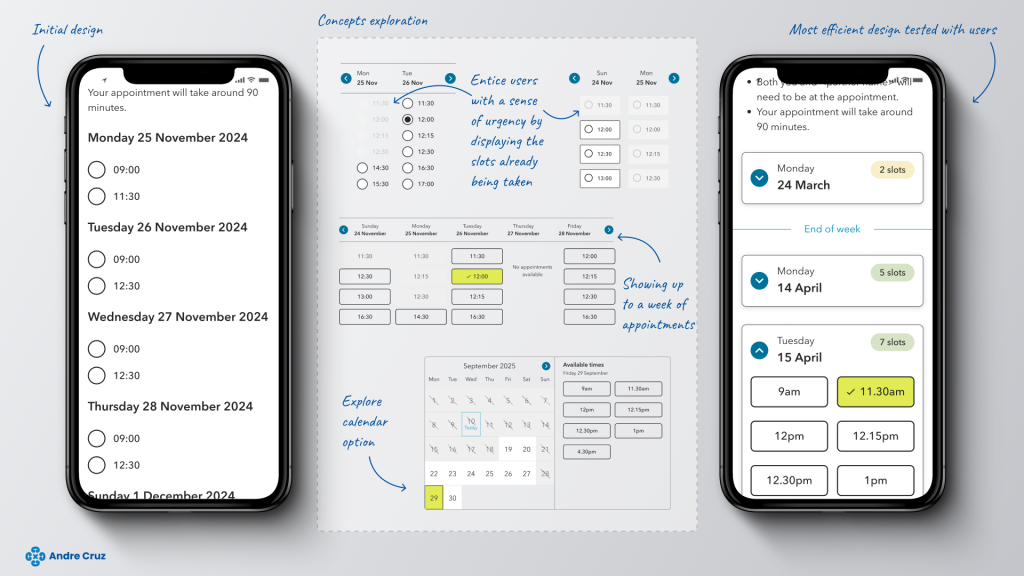
Functional prototype… in a day?!

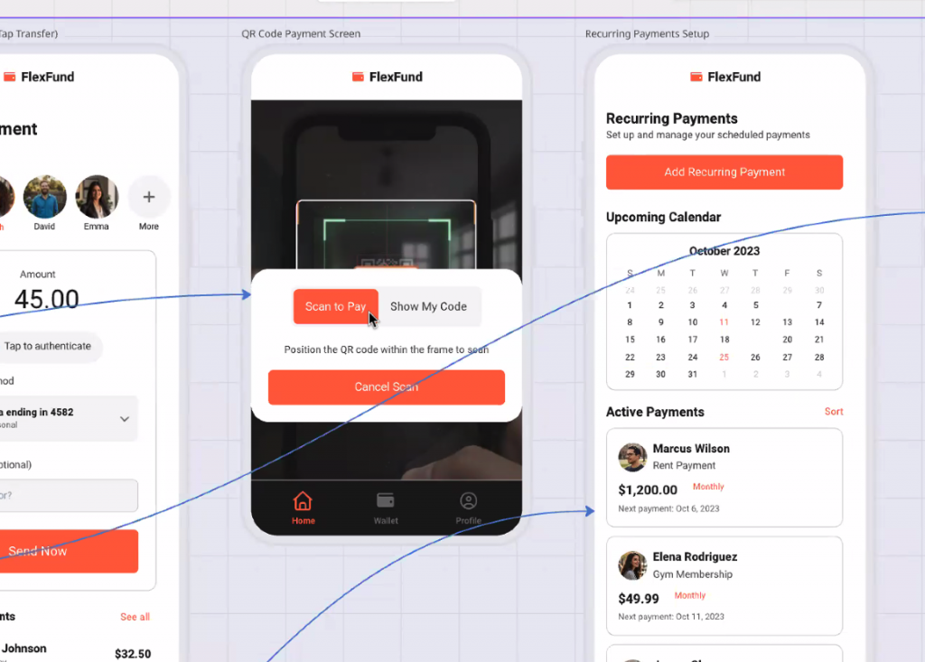
Jack didn’t just build screens.
He built:

  • A real working app
  • Installed on the Zebra handheld scanners that store colleagues actually use
  • With barcode scanning
  • Real product data
  • Real stock logic
  • Real delivery flows
  • And smart suggestions about where stock should go

All running as if it were the real product.

Designers know this level of fidelity usually takes weeks, sometimes months. Jack did it overnight.

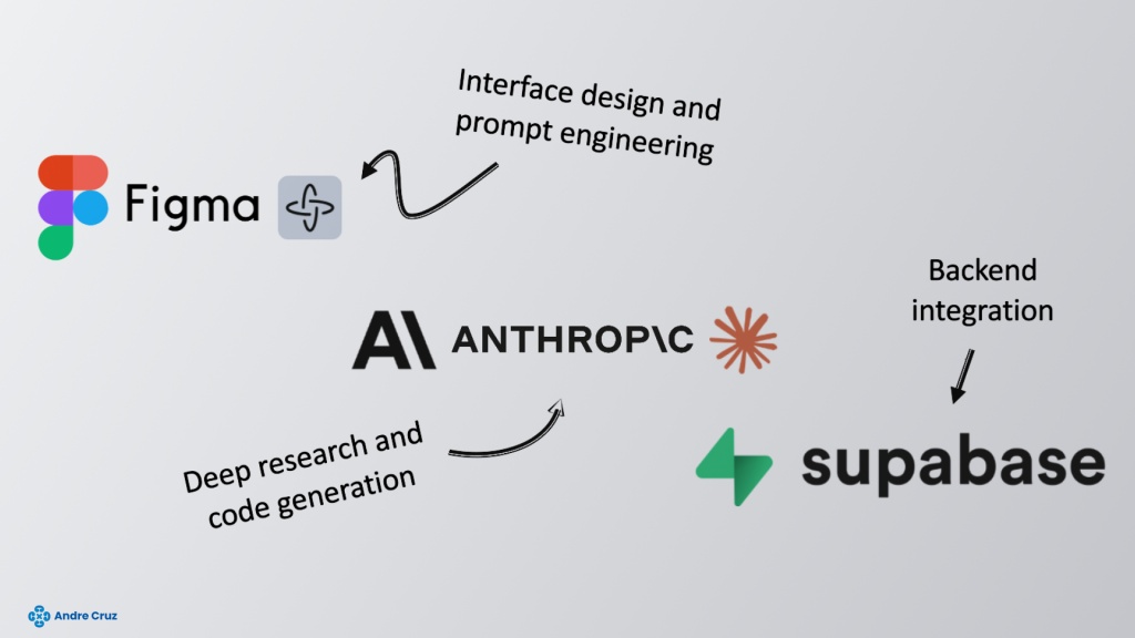
The “magic combo”: Figma + Claude + Supabase

The secret wasn’t just one tool — it was a workflow:

🟣 Figma Make

Figma’s new AI-powered “prompt-to-prototype” tool.
You describe what you want. It generates screens, flows, and code structure.

🟡 Claude (Anthropic)

Handled nearly all the heavy lifting:
coding, logic, troubleshooting, even explaining complex decisions.

🟢 Supabase

Instant backend:
auth, database, storage — without needing a backend engineer.

With these three together, Jack was basically able to say:

“Build me a stock-counting feature, let it scan barcodes, update stock levels, and show delivery data.”

…and the system did it.

Why this matters for designers

This isn’t about replacing engineers.
This is about supercharging designers so we can:

  • Prototype realistic experiences
  • Validate ideas earlier
  • Test with real data
  • Reduce guesswork
  • Shorten the time from idea → insight

Jack kept repeating the same point:
The value isn’t what he built — it’s how fast and how easily he built it.

And honestly, that’s the bit that sticks.

The opportunities

Jack highlighted some genuinely exciting possibilities:

✨ More realistic testing
✨ Faster iterations
✨ Lower cost experimentation
✨ Better collaboration
✨ Designers building things we previously couldn’t

Even better:
Figma Make is included in tools many teams already pay for, and Supabase’s free tier works for most prototype needs.

Meaning…
Designers can start today.

But of course — some risks

It’s not all sunshine:

  • These prototypes can be accidentally published online
  • Bad data hygiene = potential risk
  • Teams might try to ship prototypes instead of real code
  • Security needs proper setup
  • Businesses aren’t always ready for AI-driven workflows

Jack was crystal clear:
these prototypes are not for production — ever.

Is it gimmicky or groundbreaking?

Jack summed it up perfectly:
It can be both, depending on how we use it.

If we treat AI as a shortcut to hacky outputs → gimmick.
If we treat it as a tool to unlock new ways of working → genuinely groundbreaking.

And honestly? Seeing a working warehouse-style stock app built in a day… it’s hard not to get excited.

A final thought

AI is going to change design — not in some distant future, but right now.
Jack’s demo showed that the shift isn’t theoretical. It’s happening.

As designers, we get to choose:
be scared of the change… or shape it.

And after that session, I’m firmly in the “let’s shape it” camp.

10 Behavioural Science Tips I Took From Mike Weir’s Webinar

The other day I joined a webinar by Mike Weir on behavioural science and how it can be used to improve website experiences. Honestly, it was packed with useful stuff, so I thought I’d jot down my favourite takeaways and examples.

It’s all based around the MINDSPACE framework (a set of principles the UK government developed to understand and influence behaviour). Sounds heavy, but it’s actually really practical for anyone designing websites.

Here’s what stuck with me:

1. The messenger matters

We don’t just listen to the message — we listen to who’s saying it. Authority, expertise, or just being likeable makes all the difference.
Example: Eve Sleep pulled in posture experts on their product pages. It gave their mattresses a sense of credibility you wouldn’t get if they just shouted “trust us, we’re great.”

2. Incentives aren’t just discounts

Sure, discounts work, but incentives can also be emotional. People hate missing out. That’s why a dreamy holiday beach pic can be as powerful as a “20% off” banner.
The trick is using them in the right context — urgency works fine for a travel site, but imagine a funeral site telling you “Only 3 coffins left!”… not cool.

3. Norms shape what we do

We copy other people, especially when we’re unsure.
Example: An Icelandic car rental site highlighted “most popular” add-ons like Wi-Fi and GPS. People booked them more, but interestingly overall bookings went up too. Just seeing that others were doing it gave users confidence.

4. Defaults are powerful

Most of us stick with the default option, whether it’s a ticked box or a pre-selected plan.
Example: Mike’s team started including research as a default in proposals. Clients rarely took it out, so uptake shot up — all because it was already “there.”

5. Make things stand out

Our brains are lazy filters. If everything looks the same, we stop seeing it.
Example: A jewellery site slapped “bestseller” on one silver ring. That ring sold more… but sales of the rings near it also went up. The little label broke the monotony.

6. Feelings > facts

People remember how your site made them feel, not the exact details.
Example: A broadband provider kept apologising for roadworks. The constant negative framing left customers feeling rubbish about the brand. When they reframed it as “exciting upgrades,” complaints went down.

7. Small steps build momentum

If you can get someone to take one little action, they’re more likely to stick with the bigger one.
Example: Netflix just asks for your email first. Once you’ve done that, you feel nudged to “finish signing up.”

8. Ego drives choices

What we buy often reflects who we want to be.
Example: Rolex names its watches with themes linked to success and luxury lifestyles. People aren’t just buying a watch — they’re buying a story about themselves.

9. Priming works in the background

Sometimes just being exposed to an idea or image nudges you later.
Example: Keeping your ads and website imagery consistent helps keep your brand front-of-mind, so when users decide, you’re already in their head.

10. Do it ethically

All this stuff is powerful, but there’s a line. Just because you can use urgency, doesn’t mean you always should. The best way to check yourself? Ask: would I be okay if this was done to me?


What I took away

The big theme for me was that attention and emotion matter more than logic. People don’t decide by carefully weighing up all the options — they look for shortcuts, signals, and feelings. If you can design for that (without being manipulative), you make websites that people actually enjoy using.

As Mike said: marketing is psychology. And honestly, after this session, I don’t think I’ll ever look at a checkout flow or a “bestseller” badge the same way again.

Building Accessible Design Systems: A Simple Guide

(What I’ve learned from real projects)

A design system is only useful if everyone can use it. Over the last few years I’ve helped create systems and complex interfaces for finance tools, pension dashboards and EV analytics platforms. In every case, accessibility (following WCAG 2.1 AA standards) was not just an add-on at the end, it was part of the foundation.

In this post I’ll share some simple lessons on how to make a design system that is both scalable for teams and usable for all people.


Why accessibility matters from day one

Accessibility is not just a checklist you tick before launch. It’s a way of thinking about design from the start.

  • Colours and contrast. Your palette should already meet accessibility rules, so no one has to “fix it later.”
  • Components with behaviour. Buttons, inputs and menus should already include things like keyboard navigation, focus states and clear error messages.
  • Helpful documentation. Every component should come with examples, dos and don’ts, and notes on how it supports accessibility.

When we built the MoneyHelper design system, for example, setting strong rules for colour and text contrast made it much faster to design and develop accessible screens across the whole website.


Start small: use tokens

Tokens are just small design rules, written in a way both designers and developers can understand. Think of them as the “DNA” of your system.

Examples:

  • colour.text.main, colour.bg.surface, colour.border.focus
  • spacing.100, spacing.200
  • type.size.large, type.size.small

If you design these tokens with accessibility in mind (for example, always meeting contrast ratios), then every component built on top of them is already inclusive.


Making components everyone can use

Every component (like a button or form field) should come with:

  1. States. Normal, hover, focus, error, disabled.
  2. Keyboard rules. What happens when you tab or press enter.
  3. Labels and roles. So screen readers can describe them correctly.
  4. Clear examples. Ready-made snippets for designers and developers.

For instance:

  • A button should have only one “primary” style per screen, with a visible focus outline and a loading state.
  • A text input should always have a clear label (not just placeholder text), and error messages that are linked to the field with screen reader support.

On projects like the Pension Finder, this approach was crucial because people needed to handle very sensitive information — mistakes or unclear errors would damage trust.


When data gets complex

Some products, like dashboards or financial tools, involve heavy data. Accessibility here is about clarity:

  • Show only the most important information first.
  • Let people customise their view.
  • Make charts and tables navigable with both mouse and keyboard.
  • Provide helpful empty states (“No data yet” instead of blank screens).

On the Shell EV analytics project, simplifying the dashboards into a clear, consistent design made it easier for everyone to navigate and understand — while also making it easier for the team to maintain.


Keep your documentation simple

A design system is useless if no one reads the documentation.

  • Write task-based guides (“How to build a form”) rather than long lists of components.
  • Include examples in both Figma and code.
  • Add quick accessibility reminders like “Don’t rely on colour alone.”
  • Use simple menus and local navigation so people can find what they need.

When we did this for MoneyHelper, it reduced confusion and gave teams the confidence to design and code without second-guessing.


Sharing the responsibility

Accessibility only works if the whole team owns it.

  • Run short weekly reviews of new components.
  • Use automated tools (like Axe or Lighthouse) to check basics.
  • Keep a changelog so people know when something has changed.
  • Let product teams suggest improvements, but keep a small group in charge of final decisions.

This way, accessibility is not one person’s job — it becomes part of the team’s culture.


Quick wins you can try now

Here’s a starter checklist for any design system:

  • Choose colours that already pass contrast tests.
  • Define text sizes and spacing that work on all screens.
  • Add focus outlines and keyboard rules to components.
  • Write clear labels and error messages.
  • Keep docs short, clear, and task-focused.
  • Automate accessibility tests in your workflow.

Final thoughts

An accessible design system saves time, reduces bugs, and helps teams ship products that actually work for everyone. From my experience, the earlier you bake accessibility into the system, the easier it is to scale.

If you’d like to see some examples, check out my portfolio — I’ve applied these principles on real-world projects in finance, pensions and energy.


👉 This version keeps the authority but makes it friendlier for a wider audience (designers, developers, and even non-technical stakeholders).

Do you want me to also optimise it for SEO (titles, meta description, suggested keywords) so you can publish it straight into your site’s blog section?